One of the most difficult aspects of design is staying focused on the function.
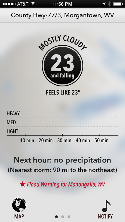
Dark Sky recently released a new version of their app. I’m not going to dissect its entire UI, because on the whole, it’s an incredibly well-designed app (and remains one of my favorites). But in an attempt to highlight where form may have inadvertently beaten out function, I’ll reference the first screen you see when the app opens:

Overall, it’s lovely. But notice where the current temperature is placed… a black, bordered circle with rainbow text. Additionally, it neglects to incorporate the one symbol that identifies, immediately, that this is a temperature reading: the degree° symbol.
But why? Why the circle? Why rainbow text? Why no ° symbol? My guess is because form, in this case, won over function, which should rarely be the goal. It certainly does look good, but if it doesn’t make sense functionally, it can’t win. It almost feels more like a logo or an avatar, not a key piece of information that this app is trying to convey (to be honest, my first thought was Michael Jordan, not the fact that it’s 23° outside).
And yes, once you know what’s going on, it’s easy to dismiss it in the “your brain is now trained” sense. That might pass if I only had a few apps on my iPhone, and I used this one every single day. But that’s not the case. Instead, I have screens full of apps, which means tons and tons of different UI’s to interpret, and I actually don’t open this app daily. So maybe therein lies the rub.
At the end of the day, this is something I still struggle with, and probably always will. Even the great designers at Dark Sky aren’t perfect. Given that, when I see these things in other designs, it serves as a reminder that function must beat form in order to achieve the best result. Today, Dark Sky was that reminder.
