Thoughts on Engineering, Photography, and Design.

Hey, I'm Ryan Heath. I design & develop things for a living and play with cameras for fun. This is where I share my thoughts on all of that — and probably more — along the way.

Putting the Kibosh on UI vs UX

This is something I’ve argued at length throughout my career, and the last paragraph sums my feelings up nicely:

Users win when we prioritize building exceptional experiences that look great and function great; that solve real problems with finesse, grace, and delight. The more we fracture all this, the more we fall short of exceptional.

Glass: An Incredible Photo App

Glass is a stunning application built for photographers. As soon as I found it, I knew it was what I’d been looking for. There are only a couple of brand new, subscription-based services that I’ve immediately signed up with, but Glass was one of them. Zero hesitation, zero regrets.

And as someone who’s into product development (if you care about that sort of thing), I can confirm for you that it has a brilliant design with an even better UX. It’s a pleasure to use and is currently my favorite app. Oh, and it’s pretty great in a browser, too.

Aside from it being a fantastic application on its own merit, the people behind it seem just as fantastic. I really love their creativity, ideas, blog posts, approach to feedback, and even their Twitter account — I’m happy to support them.

Since Instagram is no longer a good place for photographers these days (as it’s all about video, stories, and “the algorithm”), it’s a wonderful time to try something new. There are lots of alternatives out there, but for me, the clear winner is Glass, hands down.

Highly recommended.

Jam Icons

Having a consistent icon set is a big deal in product design. I stumbled upon this one, which offers close to 900 free vector icons.

Designing for the Big Picture

A very challenging aspect of designing something is keeping the holistic view in the forefront. It’s difficult because all of the individual parts of a design nag and pull for attention. We’re taught to care about the details, after all (and we should!). But that’s wherein the challenge lies: caring about the details with the big picture in mind.

Ryan Singer has talked about this a lot in the past. Specifically, in relation to designing with forces. The idea is to not let the design interfere with what the design is trying to accomplish, the problems at hand. Once you define the forces involved, that becomes your checklist for how well those individual parts are solving the problems. That separation is important.

As often the case with good solutions, it seems like a very obvious and simple approach, but we don’t always go about it this way.

I don’t think this is something that is easily conquered, it’ll be a challenge with design for as long as things are being designed. This is just one way—a pretty effective way—to mitigate the issues that can arise when the big picture hides in the background.

People are time bound entities transitioning from cradle to grave. Any “solved problem” that involves human beings solves a problem whose parameters must change through time.

A quote by Bruce Sterling
Unified Design

Yet another good talk from Cameron Moll.

Something to think about every time you design a UI.

I spotted this graphic while reading an article about Awkward UI, and found it to be a wonderfully simple reminder (and checklist?) when designing new screens.

Early On, Let Ideas Be Cheap

A couple in their very first relationship often don’t get married; your first job out of school is likely not where you will retire; when car shopping, buying the very first car you look at probably isn’t the best approach. There are a lot of “firsts” in life that you shouldn’t get overly attached to, and ideas are no different. Let them be very simple, cheap thoughts early on.

This may seem counter-intuitive because, in design, we’re taught to really focus and hone in on a solution. Pay attention to every detail. It’s hard to hear things like that while also working fast and somewhat carefree. It doesn’t feel like they match up.

But, effort is directly related to how attached to an idea you become, and time is directly related to effort. The more effort and time you put into an idea, the harder it will be to let it go if it doesn’t work. Visualizing alternatives can unintentionally be skewed by the idea you went all-in on. So avoid all-in up front. Often enough, a simple sketch can give you the insight into whether or not it’s worth pursuing. You can scratch stuff out, make notes, and literally try anything you want.

So, a reminder: don’t run the risk of designing yourself into a box by over-dedicating to an early-stage idea. Keep the jobs-to-be-done in mind, but at first, try keeping the effort low. It free’s the mind to explore. Once you feel like the direction you want to go in has been realized, dig in a little deeper and put in the time and effort to see it through.

Design Machines

Maybe one of the best articles I’ve read in 2015.

Designing In the Build

This post pretty much summarizes my thoughts on design, as well. I’ve long felt that to become a great “designer”, I had to get much better at Photoshop and other graphic-related technologies. “That’s what designers do!” Some do, yes.

But to me, design, at least in the context in which I make a living, is the experience. The look sure does play a huge role in that, but mostly, it’s what the design affords the user in the end. And, while I’m certainly welcoming of better graphic-related “chops” (they will come with time), I no longer see that as a mandatory piece to the puzzle. That’s a very exciting realization.

Design Is Expensive

The end stuck with me:

Thinking about the details, wandering around an unknown space trying to invent the right solution, is expensive.

So very true.

Creativity is just connecting things. When you ask creative people how they did something, they feel a little guilty because they didn’t really do it, they just saw something. It seemed obvious to them after a while. That’s because they were able to connect experiences they’ve had and synthesize new things. And the reason they were able to do that was that they’ve had more experiences or they have thought more about their experiences than other people.

A quote by Steve Jobs in 1996
Car UX

This is a fun site to browse through. A nice change of pace from the “traditional” user experiences I’m used to looking at.

What Design Really Means

Design is not principally measured by a product’s visual appeal; its aesthetic qualities.

It’s also measured by how it was planned and articulated, how it was built, how it functions. It’s about the design’s ability to improve upon the current reality.

Agreed. Good design involves both the form and the function.

Origins of Common UI Symbols

They are road signs for your daily rituals — the instantly recognized symbols and icons you press, click and ogle countless times a day when you interact with your computer. But how much do you know about their origins?

Shift: Is This Thing On?

I’m kind of surprised by the complaints I’m seeing on the new iOS 7.1 keyboard, specifically related to the Shift key. Folks are claiming that they have no idea if it’s on or off.

Just so we’re on the same page, here’s what I’m referring to:

iOS 7 Keyboard

The left shows the Shift key as on; the right shows it as off.

When the key is off, it blends with the dimness found on the other (non-alpha) keys. But when Shift is on, it’s bold and matches the display of the letters themselves. After all, if you touch “A” you expect it to do it’s job: give you an A. And if there’s a function of Shift, it’s to capitalize your letters (i.e. be on, not off). So thinking of an A as (always) on, doesn’t it make sense that the Shift key match the alpha keys when it is also on?

Maybe I’m scarred by thinking too deeply about these things on a day-to-day basis. To me, the existing function makes perfect sense and couldn’t be clearer. Is that because I’m often trying to solve similar UI-type problems? Or because it really is very obvious? Not sure.

Perhaps this is just another reminder of how Apple attracts very critical users, for better or for worse.

Personally, I love the iOS 7.1 keyboard. Kudos to Apple on a job well done.

Dieter Rams: Ten Principles For Good Design

Back in the late 1970s, Dieter Rams was becoming increasingly concerned by the state of the world around him — ”an impenetrable confusion of forms, colours, and noises.” Aware that he was a significant contributor to that world, he asked himself an important question: is my design good design?

Grid: A Responsive Design Guide

I’m a fan of responsive design where it makes sense. This is the best and most simplistic guide I’ve seen related to the topic.

Function Over Form

One of the most difficult aspects of design is staying focused on the function.

Dark Sky recently released a new version of their app. I’m not going to dissect its entire UI, because on the whole, it’s an incredibly well-designed app (and remains one of my favorites). But in an attempt to highlight where form may have inadvertently beaten out function, I’ll reference the first screen you see when the app opens:

Dark Sky

Overall, it’s lovely. But notice where the current temperature is placed… a black, bordered circle with rainbow text. Additionally, it neglects to incorporate the one symbol that identifies, immediately, that this is a temperature reading: the degree° symbol.

But why? Why the circle? Why rainbow text? Why no ° symbol? My guess is because form, in this case, won over function, which should rarely be the goal. It certainly does look good, but if it doesn’t make sense functionally, it can’t win. It almost feels more like a logo or an avatar, not a key piece of information that this app is trying to convey (to be honest, my first thought was Michael Jordan, not the fact that it’s 23° outside).

And yes, once you know what’s going on, it’s easy to dismiss it in the “your brain is now trained” sense. That might pass if I only had a few apps on my iPhone, and I used this one every single day. But that’s not the case. Instead, I have screens full of apps, which means tons and tons of different UI’s to interpret, and I actually don’t open this app daily. So maybe therein lies the rub.

At the end of the day, this is something I still struggle with, and probably always will. Even the great designers at Dark Sky aren’t perfect. Given that, when I see these things in other designs, it serves as a reminder that function must beat form in order to achieve the best result. Today, Dark Sky was that reminder.

One of the most challenging parts of design is breaking out of the mold and doing something entirely different. It’s hard to innovate while refining a single thought. Apple has had much success with this concept using their 10-3-1 design process.

This graphic is an attempt to illustrate why it’s important to (as the cliche goes) “step outside the box” when designing. I apologize to the original creator, as I cannot remember where I first stumbled upon this.

The Shape of Design

A subset of the Foreward in a book I’m currently reading:

In that way, this book is not unlike a more ubiquitous tool and platform, the U.S. Interstate Highway System. Today, we take it for granted, mostly, but its numbering system at one point had to be designed. At a time when telephone poles lined dirt trails, Bureau of Public Roads employee Edwin W. James and committee were asked to come up with a more expandable system as roads were growing in the 1920s. They designed what we know today as the Interstate Numbering System. Prior to that, people relied on color codes for direction. Telephone poles were ringed with color bands lined highways, corresponding to individual dirt trails across the country. As trails expanded, telephone poles became painted from the ground up, sometimes fifteen feet high, so trying to distinguish among colors became dangerous.

E. W. James changed that. He decided that motorists would be able to figure out where they were at any time given the intersection of any two highways. North/south highways would be numbered with odd numbers; east/west with even numbers; and numbers would increase as you go east and north. The Interstate Numbering System was designed for expansion, anticipating the future contributions of people, cities, unexpectedness. It’s a tool. It’s a platform. And it’s still not done nearly 100 years later.

Love that perspective. The Foreward is by Liz Danzico. The book is The Shape of Design.

Wireless Viewfinder Interchangeable Lens

What’s next for camera design? Hopefully this. WVIL: Wireless Viewfinder Interchangeable Lens.

Fight Through the Crap

It’s typical for all designers and creative people to hit a long-lasting wall where nothing they create seems good enough. It’s a defining period of time for a lot of careers, and if you’re going to make it in the design industry, it’s important that you fight through the crap.

Ira Glass puts this in perspective better than anyone else I’ve seen, so I’ll defer to him:

Nobody tells this to people who are beginners, I wish someone told me. All of us who do creative work, we get into it because we have good taste. But there is this gap. For the first couple years you make stuff, it’s just not that good. It’s trying to be good, it has potential, but it’s not. But your taste, the thing that got you into the game, is still killer. And your taste is why your work disappoints you. A lot of people never get past this phase, they quit. Most people I know who do interesting, creative work went through years of this. We know our work doesn’t have this special thing that we want it to have. We all go through this. And if you are just starting out or you are still in this phase, you gotta know its normal and the most important thing you can do is do a lot of work. Put yourself on a deadline so that every week you will finish one story. It is only by going through a volume of work that you will close that gap, and your work will be as good as your ambitions. And I took longer to figure out how to do this than anyone I’ve ever met. It’s gonna take awhile. It’s normal to take awhile. You’ve just gotta fight your way through.

Unsolicited Redesigns

I often come across sites and interfaces that make me question why something works the way it does, and I’ve often thought it’d be a fun experiment to try and improve that interface myself. But having not been there from the beginning, designing under the same constraints as the original designer(s), I rarely view it as fair or constructive. That doesn’t mean it still can’t be fun, though.

Like the last part of the article states, perhaps doing unsolicited redesigns is okay as long as you remind yourself that all of the original constraints have magically been lifted for your version of the design, rendering it much easier and free-willed.

The Instagram Square

All images posted to Instagram must be a squared crop before they can be uploaded. I personally think this was a brilliant move. Here’s why:

  • Squares are proportionally correct. There are no misalignments or elongated edges.
  • Forcing a user to choose a cropped square has somewhat of a Dribbble effect in that it demands the most interesting section of the picture.
  • Squares are predictable in terms of designing an interface. It’d be hard to argue that against the fact that better designs can be built around images that are all of the same aspect ratio. Guesswork for unknown shapes creep into design decisions early and can look clunky more often than not, and when you’re dealing with something that is largely for visual purpose (i.e. photo galleries), that matters.
  • Easier implementation has to be mentioned, since there’s no post-processing needed to crop images into squares.
  • There are no surprises: what goes in is what comes out. The image proportions remain exactly as they were prior to upload.

I don’t know if those things were considered beforehand or if it was a side-effect of some other reasoning, but I do know that I’m glad Instagram only supports squared images. It’s one of the reasons I keep coming back.

Design Is Never Done

Iterations are expensive if nothing comes out of them (and yes, sometimes that’s unavoidable). But reminding ourselves that design can (and will) always be updated helps promote a flow of constant improvements, even if they’re not perfect.

I find that asking “Is this an improvement over the last version?” instead of “Is this perfect?” yields a better release cycle and (hopefully) happier users. Let’s face it, perfection doesn’t exist, even though we all use the term (loosely). Our goal should be to release, learn, update, and release to make sure our interfaces are always trying to solve the right problems the best way possible at that moment in time.

Remember, design is never done.

Design Isn't Hard Because of CSS

I always seem to come across developers or young designers who believe the only thing preventing them from producing good design is learning CSS. Comments like “That’s simple, CSS is easy” or “I’d clean up the interface, but I don’t know CSS” completely ignore the core of what design is. Yes, CSS is incredibly easy. There are numerous tricks and, dare I say it, best practices that can be realized over time, but in general, CSS is a very easy language.

But CSS is only a means toward bringing a vision to life. It doesn’t do problem solving, it has no creativity, and it cannot satisfy client needs by itself. It’s a tool, just like any other language.

Design is hard because it demands mixing several concepts, ideas, and perspectives to produce a single, cohesive outcome. These aspects of design might include:

  • Clearly defining the problem–the most important step!
  • Determining the right solution, which often requires deep knowledge of the problem domain
  • The proper typography for the intended audience and/or goal
  • Understanding visual hierarchy
  • Meshing with existing branding (aesthetically)
  • Degrading gracefully
  • Determining the breaking points on mobile platforms (responsive design)
  • Figuring out what a client really wants

And then there are the technical aspects of executing a design, where CSS is one of the many components.

Design is far from easy, but it definitely isn’t hard because of CSS.

Progressive Enhancement Is Backwards

Progressive Enhancement is a well-known idea that web design should be a layered process, meaning a design should satisfy the least common denominator first and foremost (Internet Explorer), and then layer on enhancements for the browsers that support them. This was how I worked for a long time. But over the last couple of years I’ve been questioning it and actively doing the polar opposite. In fact, I now feel that Progressive Enhancement is backwards.

In no way am I saying that ignoring Internet Explorer is the proper approach. It’s not, as much as I’d love that. I’m saying that Internet Explorer doesn’t deserve “first dibs” on a design. It bakes in limitations and locks up the mind from the very beginning. And aside from that, Chrome, Safari, Firefox, Opera (and probably a few others I’m not aware of) are doing amazing work trying to push the web into the future via great performance and great support for HTML5 and CSS3. So why, when they are the browsers leading the way, should a design first go back in time to Internet Explorer, who is lacking in all of the areas in which the others are exceeding? It doesn’t seem fair, nor does it make much sense.

I’m of the opinion that a better design will come out of working in a cutting edge environment first and dealing with lesser environment(s) second, than working in lesser environments first and “enhancing” a restricted design second. Now, that may sound like graceful degradation, but it’s much more than that–it’s a shift in the way a designer thinks while designing, which I believe results in a much better outcome.

A freed mind can creatively take advantage of what’s possible, and only then can the full design potential come to life. I personally find it far more rewarding to be thrilled with the enhanced version than to be just happy with all versions.

Formed Function Gets A New Face

I’ve had a new design for formedfunction.com about a day from completion for quite a while now. Over the weekend I wrapped it up and shipped it out. Here’s a shot of the landing page:

formedfunction.com

It’s best viewed in a webkit-based browser (Safari and/or Chrome), but any modern browser will do just fine.

If you feel compelled to leave feedback, Twitter just may be the fastest way: @rpheath

Good design, when it’s done well, becomes invisible. It’s only when it’s done poorly that we notice it.

A quote by Jared Spool
Should you judge a book by its cover? Absolutely.

We’ve all heard it before, “don’t judge a book by its cover.” But why not? Because the creator didn’t care enough to make the cover representative of the content? I’ll need a better reason than that. In fact, that’s the exact reason why you should judge the cover.

Note: book, in this context, means a lot more than just books. It extends to anything that has a front-facing representation, ranging from a website to the packaging of your next coffee maker.

Good first impressions are where it’s at. When on a job interview a good first impression seems pretty important, right? And when you think about it, unlike products, there are a lot of ways to make that impression: clothing, attitude, previous work, eye contact, and what you have to say. Plus, there’s dedicated time set aside to focus on just you. With a product there’s only what shows on the outside. Potential buyers don’t interview products to see which one they want. So why then, would it ever be okay to neglect the first impression a product makes on a customer? Is it because websites and coffee makers can’t talk? Technically, that’s true. But products speak quite loudly–most folks just aren’t consciously aware that they’re hearing anything.

And yes… some products are very rude.

Rude products are those that don’t care about the message they’re sending. They believe that by being the product their job is done and the rest is secondary. They assume you’ll use them even though they didn’t take the time to impress you up front. They’re narcissistic.

Polite products, on the other hand, are those that really want to make you smile from the minute you’re introduced (Wufoo might be the best example of this), and they go above and beyond to make sure that’s the case. Thoughtfulness baked in from the beginning, setting the tone that you can expect good things.

While some rude products do sneak into the mix, the polite products will inevitably win out in the end.

It’s instinctual that we judge based on visual appeal, even if subconsciously, and when it comes to things that are designed there’s no better time to put our instincts to use. Start paying attention to the covers. Don’t forcefully ignore them because “the saying” said to. Often enough, those who care deeply about the outside care even more about the inside.

The journey to an end result would be a lot easier (and faster) if it was precisely known what the end result was going to be. Unfortunately, that’s rarely the case.

On Visual Hierarchy

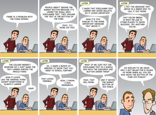
Design isn’t about making something pretty, although that’s part of it. Design is largely about function. It’s about making an interface work so well that the user never stumbles. Much of a good UI depends on a notion called visual hierarchy.

Visual hierarchy, while it may sound technical, is really a pretty simple concept. By using color, contrast, texture, shape, position, orientation, and size, one can organize elements on a page so that users gets a sense of visual importance. For example, look at this graphic:

Where did your eyes go? Maybe to the first circle, since we naturally read from left to write. Or maybe somewhere in the middle. The point is, nothing guided your eyes because all of the circles are the same.

If you make everything bold, nothing is bold.

Let’s make a slight change to that graphic:

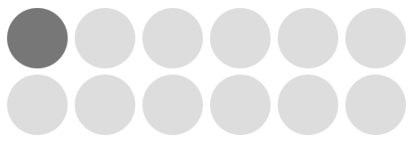
Now where did your eyes go? My guess is the first circle. With only shading, I was able to direct your eye to the circle that, for whatever reason, I believed to be the most important. This is visual hierarchy.

But we as designers don’t draw pictures of circles. Let’s talk about visual hierarchy in web design and show some real-world examples.

Note: when examining visual hierarchy, I prefer to use the squint technique (literally, I squint my eyes until the page becomes out of focus and blurred). Since I can’t blur your eyes for you, I’ll blur the screenshots instead. There’s no reason we need to see every pixel when organizing a page; in fact, the details get in the way at this stage.

A Poor Example

Ahh the Drudge Report. Much to my surprise, there are legitimate, successful designers who would argue that the Drudge Report is a well-designed site since it has “stood the test of time” (lame reasoning if you ask me). Needless to say, I’m not in that camp.

Using the Drudge Report as the guinea pig, let’s look at a poor example of visual hierarchy:

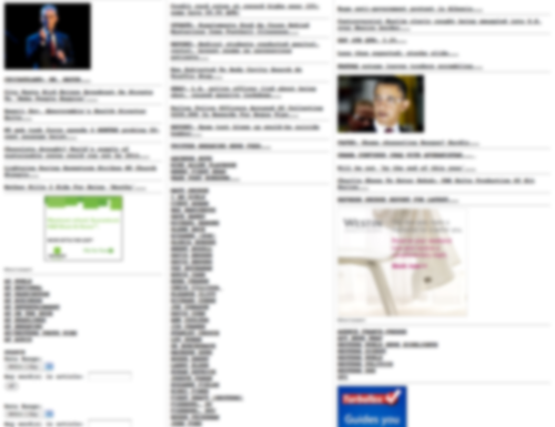
The screenshot above has 2 supporting graphics, 3 advertisements, 2 search/date filter forms, several sections, and a number of links that have different meanings. Breaking this down, the identifiable problems:

  • At a glance, you can’t tell the difference between the advertisements and the supporting article graphics.
  • There’s no easy way to detect where the search/date filter forms are located (hint: lower left corner).
  • All of the links (and sections) have the exact same treatment, but they don’t all have the exact same purpose (news articles, columnists, and content feeds).

Overall this site does a poor job of guiding the user through visual importance. Now let’s look at something I recently worked on.
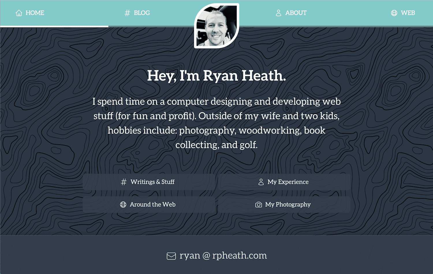
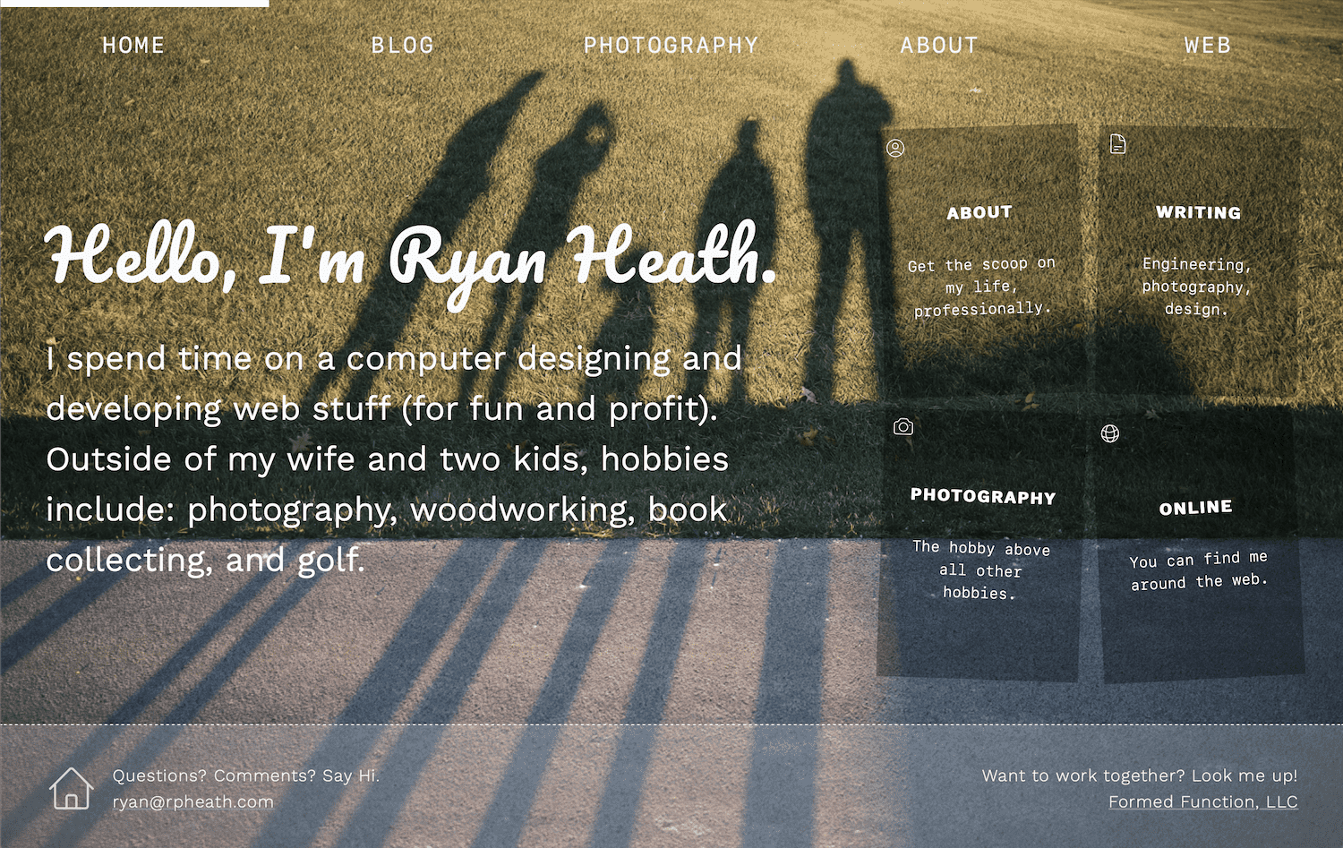
A Better Example

The situation: in an app I’m working on there is a bit of setup required before the user can dive into the core of what the app does. Since setup instructions are generally a barrier-to-entry, the goal was to make it as easy as possible for the user to get in and out, knowing the exact steps they needed to take.

First, I’ll show where I started: the screen with very little attempt to organize the page. Then I’ll show how I used visual hierarchy and the difference that it made. Here’s the undressed version:

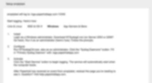
So what’s most important? I bet you don’t really know. Everything seems to be the same. You can see that there is a list, but it doesn’t really indicate that these are steps the user needs to take. It could be a grocery list for all we know (albeit, a wordy one).

Without introducing any color (yet), here’s the same page and content, only this time with an attempt to guide the user using different levels of visual importance:

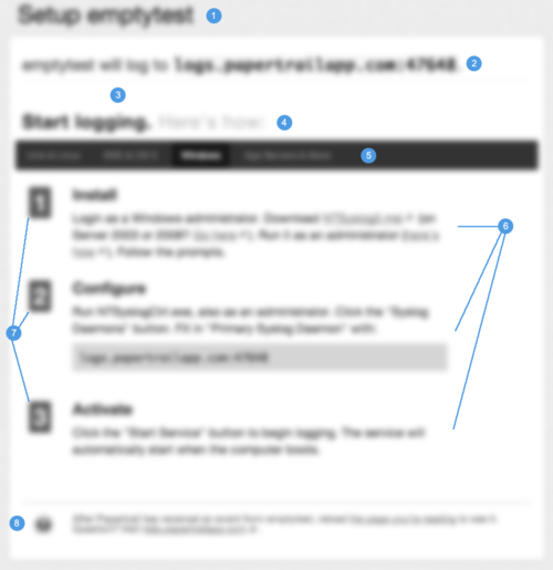
Let’s go through the changes. The numbers on the graphic correspond to the numbers in the list below.

  1. Increased header size to be clear about the item being setup. It should be crystal clear as to what exactly is being setup.
  2. This line needs to speak to the user before anything else, because for experienced users, it could potentially remove the need for the setup instructions altogether. So I increased the font a bit and separated it from the content below using a border-bottom (look closely).
  3. Using nothing but space, I was able to disconnect the upper and lower content sections even more, essentially saying “Read This First”.
  4. This title sets up the purpose of the content below it, so I bumped up the font size and made it bold. Subtext next to it isn’t quite as important, so it’s dimmed a bit (but by drawing attention to the main text, the right text is inherently read, but without the additional noise).
  5. This is a menu of options where each option contains its own set of instructions–it’s incredibly important that the user knows which option they’re on, but above that it’s to illustrate that their are options. Also, this menu was to act as a header to ground the instruction set below it.
  6. Each “step” has a title and a instruction. By bumping up the section title I’ve essentially scoped what the content below it is explaining. It’s important that the user could scan the list just to get an idea of what was involved, then dive into the details. The instruction paragraph was also given more space above/below and increased line-height to help with readability.
  7. These numbers should feel more like “steps” than a list. By squaring them up, increasing the size, and giving some visual depth (contrast), I was able to achieve that. This no longer feels like a wordy grocery list.
  8. The support help/text is important, but it should not get equal attention as the instructions themselves. So by moving it down the page, decreasing the size/line-height, and softening the color, I am basically saying “this is here if you want it, but it’s not quite as important as the rest”. In the rare case that a user needs more help, he/she will be explicitly scanning the page for help information, so it’s less of a concern to make it stand out–it will undoubtedly be found if need be.

When positioning elements on a page I like to work in gray tones first, like the screenshot above. You can do a lot with just contrast and sometimes colors get in the way early on. However, once you achieve a solid foundation on position and weight, color can take the visual importance even further. Take a look at the same screenshot, but in color:

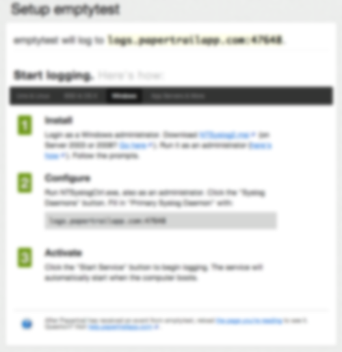
The end result is much better than where I started. It’s now (hopefully) clear to the user that they have a step-by-step process to go through, and (hopefully) each step is clearly defined and explained.

Conclusion

Visual hierarchy is just another tool in the tool-belt, but I believe it’s among the most important. If nothing else, hopefully this helps other designers by at least reminding them to start with the function and flow before the fancy graphics. Nail down the purpose of each page element, and then dress it up.

Happy designing!

On Design Criticism: Out With the Negative, In With the Constructive

Whenever something relatively large launches (like a Facebook update or New Twitter) there are always a slew of “haters” disrespectfully attacking the design from all angles. The problem is blatant disrespect is rarely constructive.

Take the whole Gap logo redesign ordeal. That was a prime example of how not to be. Other designers were mocking the logo with “Crap” (instead of Gap) and being incredibly demeaning toward those who worked on the redesign. It was an awful display of character by so many people.

Currently it seems that the hot, fresh out-of-the-box target is the Mac App Store. For example, take a quote from this response (titled, Mac App Store UI is so hideous that it makes me want to kick a swan):

As expected, it pretty much confirms my thoughts that someone decided to shoot most of Apple’s designers some time around when brushed metal appeared, along with giving everyone at Cupertino a taste-ectomy. The app UI is just hideous, kicking conventions in the bollocks, laughing in the face of clarity, and mercilessly setting fire to UX and pushing it off a cliff.

Seriously? That bad, huh? Even if so, I don’t think it deserves such a degrading response. Nothing does, really. What that quote could have been:

I’m not a fan of the Mac App Store UI. A few common conventions have been broken and the overall experience isn’t as good as it could be, especially coming from the UX experts at Apple. For example, …

That post does go on to make several valid points, but it’s the link-baiting negativity in the title and intro that bothers me. There’s simply no benefit in barefaced negativity toward someone else’s design.

The same thing happens in sports. There will always be fans who get pissed off at a coach for a bad play call, when more often than not, the person complaining couldn’t do a fraction of the job the coach is doing. In sports I expect it, but I really hate to see this behavior make its way into design communities. Every single designer to date has produced crappy work. It’s part of getting better.

It’s challenging to produce good design, there’s no doubt about it. There are many problems to solve within a single solution. But what’s not challenging is to come along at the end and pick out the 5-10% that may be off kilter and run it into the ground because “you could do better”. It’s a different view when starting with a blank slate, I can assure you.

Next time try to remember that there are caring people behind both good and bad design who, in most cases, put a lot of time, thought, and effort into what they do. Maybe they’re not professionals (yet), but they’re trying.

So let’s declare 2011 the year for constructive criticism and we can raise our glasses to better design as a result.

I seem to always reference this concept.

How would you like your design?

Design is not just what it looks like and feels like. Design is how it works.

A quote by Steve Jobs

I apologize for writing you a long letter but I didn’t have time to write a short one.

A quote by Blaise Pascal

Design principles are the guiding light for any software application. They define and communicate the key characteristics of the product to a wide variety of stakeholders including clients, colleagues, and team members. Design principles articulate the fundamental goals that all decisions can be measured against and thereby keep the pieces of a project moving toward an integrated whole.

A quote by Luke Wroblewski on Developing Design Principles
Clients: Browsers Are Different, Accept It

It’s mind-boggling how many times I’ve heard designers say something like “I can’t wait until CSS3 is supported across all browsers so I can start using it!” If that sounds like a reasonable claim to you, don’t worry, you’re not alone–even I used to think that way. But that perspective is a real problem.

If/When CSS3 is finally supported across all browsers, there will be browsers with CSS4 support. It’s a never-ending cycle. Some browsers will live on the bleeding edge of technology, and some will take years to catch up. That’s the way it will always be, so it doesn’t make sense to design by the least common denominator, hanging on to false hope, dreaming of the day when you’ll implement a design once. Your life as a designer is too short for that! You should be using the cool stuff as fast as it comes out (where applicable, of course).

Cross-browser support for CSS3 and similar technologies is often said to be the greatest day in a designer’s life. “Can you imagine the day when all browsers are the same?” Back to reality. I say the greatest day in a designers life is when clients begin to realize and understand that their design simply cannot look the same in every browser. That’s the breakthrough I’m waiting for, and that’s what will give designers more freedom to truly be creative.

Browses are different, we (designers and clients alike) need to accept that so we can move on and create awesomeness.