Thoughts on Engineering, Photography, and Design.

Hey, I'm Ryan Heath. I design & develop things for a living and play with cameras for fun. This is where I share my thoughts on all of that — and probably more — along the way.

Glass: An Incredible Photo App

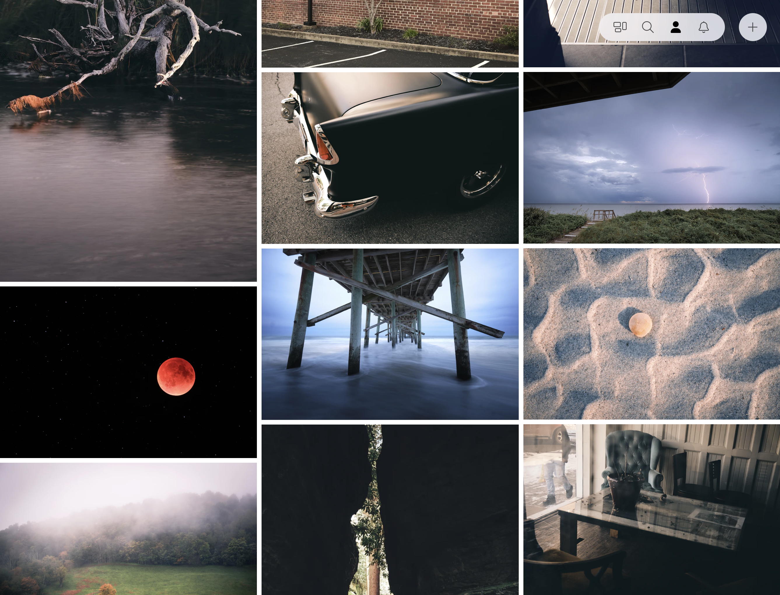
Glass is a stunning application built for photographers. As soon as I found it, I knew it was what I’d been looking for. There are only a couple of brand new, subscription-based services that I’ve immediately signed up with, but Glass was one of them. Zero hesitation, zero regrets.

And as someone who’s into product development (if you care about that sort of thing), I can confirm for you that it has a brilliant design with an even better UX. It’s a pleasure to use and is currently my favorite app. Oh, and it’s pretty great in a browser, too.

Aside from it being a fantastic application on its own merit, the people behind it seem just as fantastic. I really love their creativity, ideas, blog posts, approach to feedback, and even their Twitter account — I’m happy to support them.

Since Instagram is no longer a good place for photographers these days (as it’s all about video, stories, and “the algorithm”), it’s a wonderful time to try something new. There are lots of alternatives out there, but for me, the clear winner is Glass, hands down.

Highly recommended.

Noizio — Ambient Sound Equalizer

I’ve only been using this app briefly, but if you like noise while working that’s not always music, this might be exactly the app. It stays out of the way, great little UI, and does what it says very well (although, keyboard shortcuts would be a welcome addition).

Humanizing Software

User-friendly software is a goal for anyone who builds or designs it. It’s a very tough challenge. Code, best practices, and browser-restrictions all get in the way, clouding up the human-factor.

For example, let’s look at user-restrictions. It’s easy, in code, to make a decision firm. Let’s say Plan A offers 5 users and Plan B offers 10 users. The logic to add a new user might go through a path like this:

1if (plan == A && users.count == 5) {
2  # too bad, you're maxed out!
3}

That’s what the software says. Clear as day, hard and firm. There are no considerations beyond that. But what if someone needs only 6 users? Just ONE more? Is the best solution forcing them to upgrade to Plan B? Maybe it is, but I’m not so sure.

What if that same conditional could be more like:

1if (plan == A && users.count == "close enough") {
2  # go for it, we want to make you happy!
3}

Is it better to have a happy customer with 6 users on a 5 user plan than a frustrated customer with 5 users on a 5 user plan? Forcing that customer to make a decision bumps up the chances they will leave. And if they don’t leave, odds are they’re hovering around the 5 user limit “making it work” to avoid the upgrade. So now they’re inconvenienced by the product, and that might leave a bad taste.

I’m aware that a line has to be drawn somewhere. Allowing 20 users on Plan A is surely too much, but paying extra attention to the edges is an interesting thought. If this were done manually, human-to-human, a real person might say “it’s no big deal, you can have one more user” in an effort to keep the person happy. Why shouldn’t software do the same thing?

Generally, rules are rules, and so it’s expected (even by customers) that they live within their plan restrictions. But wow, what an opportunity to go the extra mile and make a customer that much happier!

User-restrictions are just one of many areas where we can consider being less robotic. So, yeah, humanizing software. That’s what I’ve been thinking about lately. We’ll see where it takes me.

Function Over Form

One of the most difficult aspects of design is staying focused on the function.

Dark Sky recently released a new version of their app. I’m not going to dissect its entire UI, because on the whole, it’s an incredibly well-designed app (and remains one of my favorites). But in an attempt to highlight where form may have inadvertently beaten out function, I’ll reference the first screen you see when the app opens:

Dark Sky

Overall, it’s lovely. But notice where the current temperature is placed… a black, bordered circle with rainbow text. Additionally, it neglects to incorporate the one symbol that identifies, immediately, that this is a temperature reading: the degree° symbol.

But why? Why the circle? Why rainbow text? Why no ° symbol? My guess is because form, in this case, won over function, which should rarely be the goal. It certainly does look good, but if it doesn’t make sense functionally, it can’t win. It almost feels more like a logo or an avatar, not a key piece of information that this app is trying to convey (to be honest, my first thought was Michael Jordan, not the fact that it’s 23° outside).

And yes, once you know what’s going on, it’s easy to dismiss it in the “your brain is now trained” sense. That might pass if I only had a few apps on my iPhone, and I used this one every single day. But that’s not the case. Instead, I have screens full of apps, which means tons and tons of different UI’s to interpret, and I actually don’t open this app daily. So maybe therein lies the rub.

At the end of the day, this is something I still struggle with, and probably always will. Even the great designers at Dark Sky aren’t perfect. Given that, when I see these things in other designs, it serves as a reminder that function must beat form in order to achieve the best result. Today, Dark Sky was that reminder.

Scorekeeper for PlayBook and iOS

Scorekeeper is a minimalistic scorekeeping app. It has a very thoughtful UI that uses icons, color, sound, and just the right amount of animation. I love how the reordering happens a few seconds after you update the score so you can change a few at a time. Even if you don’t have a user for it, watch the video.

Pinboard's Pricing Model

With all of this talk of delicious going away, I too exported my bookmarks and decided to try out Pinboard. Before signing up I noticed there was a price, which I was not expecting. It was only a small one-time fee, worth the money alone just for safe-keeping of my years worth of bookmarks.

But what struck me the most was the fee itself: $6.47. It was kind of an odd number. After looking into it, I realized it’s actually quite smart.

Pinboard charges $0.001 times the number of customers it has, for each new user. And when you think about it, this works on a lot of different levels.

Spam protection. Immediate spam protection because spammers don’t pay. This keeps the system itself clean of spam-checking code, too. And not to mention serious users only. A win right off the bat.

Marketing. The longer you wait to sign up, the more it’s going to cost you. It gives you the “OMG I need to hurry” urge that brings out the impulsiveness in all of us.

Scaling. The more users they have, the more it costs to sign up per-user, hence, the more money they make to keep the service running.

One-time fee. I think most people would be more inclined to pay a larger one-time fee than a smaller recurring charge. It’s closure for customers and simplicity for Pinboard. Plus, even though it’s a one-time fee, the fee keeps going up, so in a way they’re still making money off of their other customers, but without charging them.

And I’m probably overlooking a few other things, but in general, I think that’s a pretty clever way to charge your users.