I’m kind of surprised by the complaints I’m seeing on the new iOS 7.1 keyboard, specifically related to the Shift key. Folks are claiming that they have no idea if it’s on or off.
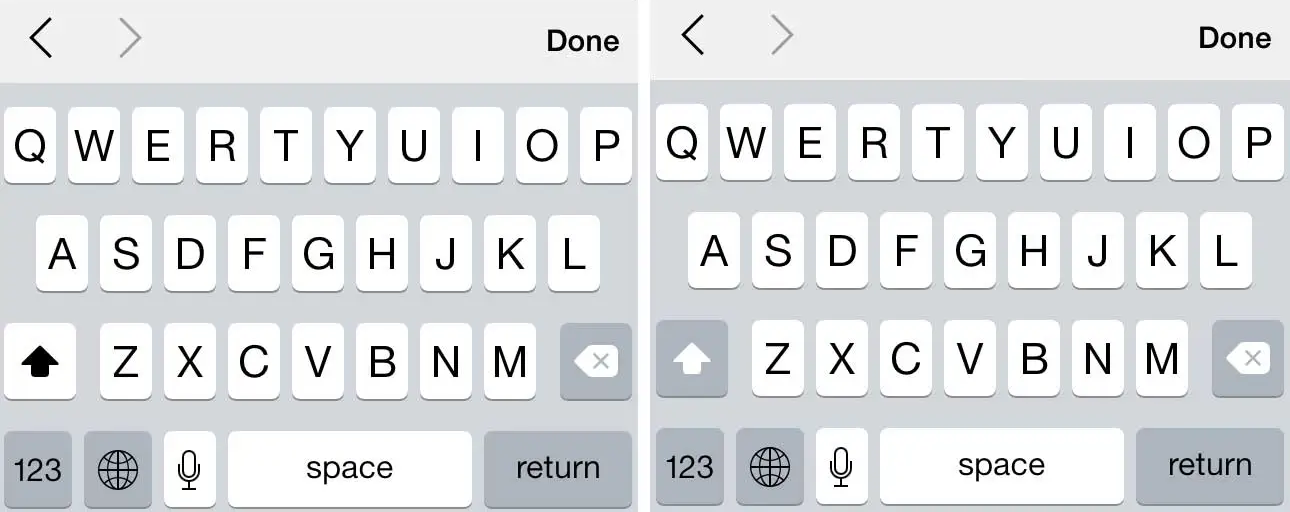
Just so we’re on the same page, here’s what I’m referring to:

The left shows the Shift key as on; the right shows it as off.
When the key is off, it blends with the dimness found on the other (non-alpha) keys. But when Shift is on, it’s bold and matches the display of the letters themselves. After all, if you touch “A” you expect it to do it’s job: give you an A. And if there’s a function of Shift, it’s to capitalize your letters (i.e. be on, not off). So thinking of an A as (always) on, doesn’t it make sense that the Shift key match the alpha keys when it is also on?
Maybe I’m scarred by thinking too deeply about these things on a day-to-day basis. To me, the existing function makes perfect sense and couldn’t be clearer. Is that because I’m often trying to solve similar UI-type problems? Or because it really is very obvious? Not sure.
Perhaps this is just another reminder of how Apple attracts very critical users, for better or for worse.
Personally, I love the iOS 7.1 keyboard. Kudos to Apple on a job well done.

