Thoughts on Engineering, Photography, and Design.

Hey, I'm Ryan Heath. I design & develop things for a living and play with cameras for fun. This is where I share my thoughts on all of that — and probably more — along the way.

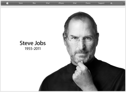
Steve Jobs Reading "The Crazy One's"

I recently purchased a very well-done (letter pressed) piece of artwork in remembrance of Apple’s core philosophy: Think Different. This refers to the infamous 1997 marketing campaign that started Apple’s march back to the top, led by Steve Jobs.

It’s a sad day.

Apple has lost a visionary and creative genius, and the world has lost an amazing human being. Those of us who have been fortunate enough to know and work with Steve have lost a dear friend and inspiring mentor. Steve leaves behind a company that only he could have built, and his spirit will forever be the foundation of Apple.

This has affected me more than I expected. I saw a picture online of an empty “reserved” seat in the front row of the iPhone 4s announcement yesterday, and hoped it was nothing serious. Unfortunately, it was.

Steve Jobs has been an indescribable inspiration to me and everyone in this industry. He will be missed dearly.

Fight Through the Crap

It’s typical for all designers and creative people to hit a long-lasting wall where nothing they create seems good enough. It’s a defining period of time for a lot of careers, and if you’re going to make it in the design industry, it’s important that you fight through the crap.

Ira Glass puts this in perspective better than anyone else I’ve seen, so I’ll defer to him:

Nobody tells this to people who are beginners, I wish someone told me. All of us who do creative work, we get into it because we have good taste. But there is this gap. For the first couple years you make stuff, it’s just not that good. It’s trying to be good, it has potential, but it’s not. But your taste, the thing that got you into the game, is still killer. And your taste is why your work disappoints you. A lot of people never get past this phase, they quit. Most people I know who do interesting, creative work went through years of this. We know our work doesn’t have this special thing that we want it to have. We all go through this. And if you are just starting out or you are still in this phase, you gotta know its normal and the most important thing you can do is do a lot of work. Put yourself on a deadline so that every week you will finish one story. It is only by going through a volume of work that you will close that gap, and your work will be as good as your ambitions. And I took longer to figure out how to do this than anyone I’ve ever met. It’s gonna take awhile. It’s normal to take awhile. You’ve just gotta fight your way through.

Unsolicited Redesigns

I often come across sites and interfaces that make me question why something works the way it does, and I’ve often thought it’d be a fun experiment to try and improve that interface myself. But having not been there from the beginning, designing under the same constraints as the original designer(s), I rarely view it as fair or constructive. That doesn’t mean it still can’t be fun, though.

Like the last part of the article states, perhaps doing unsolicited redesigns is okay as long as you remind yourself that all of the original constraints have magically been lifted for your version of the design, rendering it much easier and free-willed.

The Instagram Square

All images posted to Instagram must be a squared crop before they can be uploaded. I personally think this was a brilliant move. Here’s why:

  • Squares are proportionally correct. There are no misalignments or elongated edges.
  • Forcing a user to choose a cropped square has somewhat of a Dribbble effect in that it demands the most interesting section of the picture.
  • Squares are predictable in terms of designing an interface. It’d be hard to argue that against the fact that better designs can be built around images that are all of the same aspect ratio. Guesswork for unknown shapes creep into design decisions early and can look clunky more often than not, and when you’re dealing with something that is largely for visual purpose (i.e. photo galleries), that matters.
  • Easier implementation has to be mentioned, since there’s no post-processing needed to crop images into squares.
  • There are no surprises: what goes in is what comes out. The image proportions remain exactly as they were prior to upload.

I don’t know if those things were considered beforehand or if it was a side-effect of some other reasoning, but I do know that I’m glad Instagram only supports squared images. It’s one of the reasons I keep coming back.

Design Is Never Done

Iterations are expensive if nothing comes out of them (and yes, sometimes that’s unavoidable). But reminding ourselves that design can (and will) always be updated helps promote a flow of constant improvements, even if they’re not perfect.

I find that asking “Is this an improvement over the last version?” instead of “Is this perfect?” yields a better release cycle and (hopefully) happier users. Let’s face it, perfection doesn’t exist, even though we all use the term (loosely). Our goal should be to release, learn, update, and release to make sure our interfaces are always trying to solve the right problems the best way possible at that moment in time.

Remember, design is never done.

The Real Thing

Earlier today I watched Mike Matas: A next-generation digital book. If you follow him at all, you’ll know he’s an expert in design and UI, proven through his work on Mac OS and the iPhone. So naturally, before I started the video I expected his vision for digital content to be a good one. I was not disappointed: it was a really good one.

However, as good as the interactions and ideas were in their approach, I still see the value in regular books. I would hate the day the world goes all digital. Maybe it’s because I’m a designer and hence a visual person, but I find enjoyment in owning a physical book. Most of the books I buy are design-related, and things like textures, quality of the paper, the cover art, the spine, and content imagery are often just as inspiring (see Hardboiled Web Design). Those features – real, physical features – should not be taken for granted.

Plus, what would this shelving unit look like if physical books were obsolete?

Bookshelf

Something tells me they would lose their appeal if it were just an iPad sitting on its dock.

I’m all for digital books. I personally own a Kindle and I read content via iBooks on my iPad all the time. Digital books absolutely have their place in todays world, I just hope it’s not at the expense of the real thing.

Design Isn't Hard Because of CSS

I always seem to come across developers or young designers who believe the only thing preventing them from producing good design is learning CSS. Comments like “That’s simple, CSS is easy” or “I’d clean up the interface, but I don’t know CSS” completely ignore the core of what design is. Yes, CSS is incredibly easy. There are numerous tricks and, dare I say it, best practices that can be realized over time, but in general, CSS is a very easy language.

But CSS is only a means toward bringing a vision to life. It doesn’t do problem solving, it has no creativity, and it cannot satisfy client needs by itself. It’s a tool, just like any other language.

Design is hard because it demands mixing several concepts, ideas, and perspectives to produce a single, cohesive outcome. These aspects of design might include:

  • Clearly defining the problem–the most important step!
  • Determining the right solution, which often requires deep knowledge of the problem domain
  • The proper typography for the intended audience and/or goal
  • Understanding visual hierarchy
  • Meshing with existing branding (aesthetically)
  • Degrading gracefully
  • Determining the breaking points on mobile platforms (responsive design)
  • Figuring out what a client really wants

And then there are the technical aspects of executing a design, where CSS is one of the many components.

Design is far from easy, but it definitely isn’t hard because of CSS.

Progressive Enhancement Is Backwards

Progressive Enhancement is a well-known idea that web design should be a layered process, meaning a design should satisfy the least common denominator first and foremost (Internet Explorer), and then layer on enhancements for the browsers that support them. This was how I worked for a long time. But over the last couple of years I’ve been questioning it and actively doing the polar opposite. In fact, I now feel that Progressive Enhancement is backwards.

In no way am I saying that ignoring Internet Explorer is the proper approach. It’s not, as much as I’d love that. I’m saying that Internet Explorer doesn’t deserve “first dibs” on a design. It bakes in limitations and locks up the mind from the very beginning. And aside from that, Chrome, Safari, Firefox, Opera (and probably a few others I’m not aware of) are doing amazing work trying to push the web into the future via great performance and great support for HTML5 and CSS3. So why, when they are the browsers leading the way, should a design first go back in time to Internet Explorer, who is lacking in all of the areas in which the others are exceeding? It doesn’t seem fair, nor does it make much sense.

I’m of the opinion that a better design will come out of working in a cutting edge environment first and dealing with lesser environment(s) second, than working in lesser environments first and “enhancing” a restricted design second. Now, that may sound like graceful degradation, but it’s much more than that–it’s a shift in the way a designer thinks while designing, which I believe results in a much better outcome.

A freed mind can creatively take advantage of what’s possible, and only then can the full design potential come to life. I personally find it far more rewarding to be thrilled with the enhanced version than to be just happy with all versions.

Formed Function Gets A New Face

I’ve had a new design for formedfunction.com about a day from completion for quite a while now. Over the weekend I wrapped it up and shipped it out. Here’s a shot of the landing page:

formedfunction.com

It’s best viewed in a webkit-based browser (Safari and/or Chrome), but any modern browser will do just fine.

If you feel compelled to leave feedback, Twitter just may be the fastest way: @rpheath