Truly. Well done.

Thoughts on Engineering, Photography, and Design.
Hey, I'm Ryan Heath. I design & develop things for a living and play with cameras for fun. This is where I share my thoughts on all of that — and probably more — along the way.
They are road signs for your daily rituals — the instantly recognized symbols and icons you press, click and ogle countless times a day when you interact with your computer. But how much do you know about their origins?
Shift: Is This Thing On?
I’m kind of surprised by the complaints I’m seeing on the new iOS 7.1 keyboard, specifically related to the Shift key. Folks are claiming that they have no idea if it’s on or off.
Just so we’re on the same page, here’s what I’m referring to:
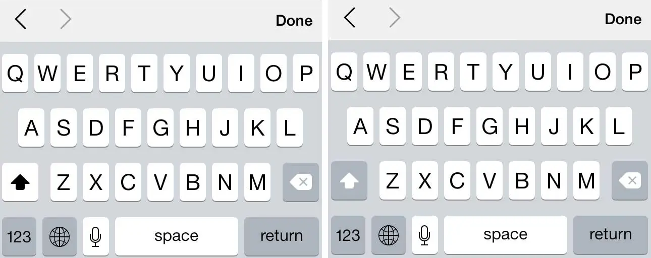
The left shows the Shift key as on; the right shows it as off.
When the key is off, it blends with the dimness found on the other (non-alpha) keys. But when Shift is on, it’s bold and matches the display of the letters themselves. After all, if you touch “A” you expect it to do it’s job: give you an A. And if there’s a function of Shift, it’s to capitalize your letters (i.e. be on, not off). So thinking of an A as (always) on, doesn’t it make sense that the Shift key match the alpha keys when it is also on?
Maybe I’m scarred by thinking too deeply about these things on a day-to-day basis. To me, the existing function makes perfect sense and couldn’t be clearer. Is that because I’m often trying to solve similar UI-type problems? Or because it really is very obvious? Not sure.
Perhaps this is just another reminder of how Apple attracts very critical users, for better or for worse.
Personally, I love the iOS 7.1 keyboard. Kudos to Apple on a job well done.
Back in the late 1970s, Dieter Rams was becoming increasingly concerned by the state of the world around him — ”an impenetrable confusion of forms, colours, and noises.” Aware that he was a significant contributor to that world, he asked himself an important question: is my design good design?
I’m a fan of responsive design where it makes sense. This is the best and most simplistic guide I’ve seen related to the topic.
If I had to choose a career other than web design/development, I think I’d try my hand in advertising. I see far more not-so-good ads than great ones, but when I do see the great ones, they’re inspiring. What a creative outlet advertising must be.
I’ve been following a Twitter feed for a while related to this: @Brilliant_Ads.
Function Over Form
One of the most difficult aspects of design is staying focused on the function.
Dark Sky recently released a new version of their app. I’m not going to dissect its entire UI, because on the whole, it’s an incredibly well-designed app (and remains one of my favorites). But in an attempt to highlight where form may have inadvertently beaten out function, I’ll reference the first screen you see when the app opens:

Overall, it’s lovely. But notice where the current temperature is placed… a black, bordered circle with rainbow text. Additionally, it neglects to incorporate the one symbol that identifies, immediately, that this is a temperature reading: the degree° symbol.
But why? Why the circle? Why rainbow text? Why no ° symbol? My guess is because form, in this case, won over function, which should rarely be the goal. It certainly does look good, but if it doesn’t make sense functionally, it can’t win. It almost feels more like a logo or an avatar, not a key piece of information that this app is trying to convey (to be honest, my first thought was Michael Jordan, not the fact that it’s 23° outside).
And yes, once you know what’s going on, it’s easy to dismiss it in the “your brain is now trained” sense. That might pass if I only had a few apps on my iPhone, and I used this one every single day. But that’s not the case. Instead, I have screens full of apps, which means tons and tons of different UI’s to interpret, and I actually don’t open this app daily. So maybe therein lies the rub.
At the end of the day, this is something I still struggle with, and probably always will. Even the great designers at Dark Sky aren’t perfect. Given that, when I see these things in other designs, it serves as a reminder that function must beat form in order to achieve the best result. Today, Dark Sky was that reminder.
The craftman’s desire for quality poses a motivational danger: the obsession with getting things perfectly right may deform the work itself. We are more likely to fail as craftsmen, I argue, due to our inability to organize obsession than because of our lack of ability.
Modern Day Craftsmanship
I design and build software for a living. There’s a lot of care and attention to detail that goes into software and design. And that’s what I do. It’s my craft.
Generally speaking, working in this industry has sharpened my eye. I seem to notice (and care) more and more about the detail that was put into everyday things. But I have to question if today’s “craftsman” can compete with those of the early days?
For example, I’m still in awe of the old, classic muscle cars. They’re timeless in a lot of ways. What cars of today will my grandkids look back on and wish they had? Even the latest Mustangs and Camaros are paying homage to the classic designs.
And what about music? Some of my favorite songs come from artists before my time. Subjective, I know, but I can’t help but wonder what music from today will still be selling in 40 years? I certainly don’t think Bieber Fever will last that long.
Maybe one of the most disappointing observations of all comes from modern day homebuilding. It’s just not the same. On the grand scale homebuilding has lost something. There’s no character or charm, rooms are just boxy and boring. That single-family, two-story bungalow with the wide porch pillars, tall baseboard, and detailed moldings is hard to find these days. If that’s your style, you might have to buy one built in the 1950s and renovate it.
Being only 31 years old, I realize it’s not entirely fair for me to speak to how they used to do it; but when compared to the craftsman of old, there’s clearly something missing from today’s output.
I believe the solution starts with the individual. We need to bring the craftsman back to craftsmanship. Care about what you do. You won’t be disappointed and the outcome(s) will undoubtedly lead you to a more fulfilled life.
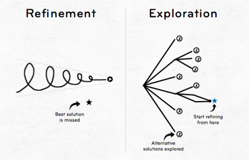
One of the most challenging parts of design is breaking out of the mold and doing something entirely different. It’s hard to innovate while refining a single thought. Apple has had much success with this concept using their 10-3-1 design process.
This graphic is an attempt to illustrate why it’s important to (as the cliche goes) “step outside the box” when designing. I apologize to the original creator, as I cannot remember where I first stumbled upon this.