Thoughts on Engineering, Photography, and Design.

Hey, I'm Ryan Heath. I design & develop things and play with cameras for fun. This is where I share my thoughts on all of that along the way.

Good design, when it’s done well, becomes invisible. It’s only when it’s done poorly that we notice it.

A quote by Jared Spool
Should you judge a book by its cover? Absolutely.

We’ve all heard it before, “don’t judge a book by its cover.” But why not? Because the creator didn’t care enough to make the cover representative of the content? I’ll need a better reason than that. In fact, that’s the exact reason why you should judge the cover.

Note: book, in this context, means a lot more than just books. It extends to anything that has a front-facing representation, ranging from a website to the packaging of your next coffee maker.

Good first impressions are where it’s at. When on a job interview a good first impression seems pretty important, right? And when you think about it, unlike products, there are a lot of ways to make that impression: clothing, attitude, previous work, eye contact, and what you have to say. Plus, there’s dedicated time set aside to focus on just you. With a product there’s only what shows on the outside. Potential buyers don’t interview products to see which one they want. So why then, would it ever be okay to neglect the first impression a product makes on a customer? Is it because websites and coffee makers can’t talk? Technically, that’s true. But products speak quite loudly–most folks just aren’t consciously aware that they’re hearing anything.

And yes… some products are very rude.

Rude products are those that don’t care about the message they’re sending. They believe that by being the product their job is done and the rest is secondary. They assume you’ll use them even though they didn’t take the time to impress you up front. They’re narcissistic.

Polite products, on the other hand, are those that really want to make you smile from the minute you’re introduced (Wufoo might be the best example of this), and they go above and beyond to make sure that’s the case. Thoughtfulness baked in from the beginning, setting the tone that you can expect good things.

While some rude products do sneak into the mix, the polite products will inevitably win out in the end.

It’s instinctual that we judge based on visual appeal, even if subconsciously, and when it comes to things that are designed there’s no better time to put our instincts to use. Start paying attention to the covers. Don’t forcefully ignore them because “the saying” said to. Often enough, those who care deeply about the outside care even more about the inside.

The journey to an end result would be a lot easier (and faster) if it was precisely known what the end result was going to be. Unfortunately, that’s rarely the case.

On Visual Hierarchy

Design isn’t about making something pretty, although that’s part of it. Design is largely about function. It’s about making an interface work so well that the user never stumbles. Much of a good UI depends on a notion called visual hierarchy.

Visual hierarchy, while it may sound technical, is really a pretty simple concept. By using color, contrast, texture, shape, position, orientation, and size, one can organize elements on a page so that users gets a sense of visual importance. For example, look at this graphic:

Where did your eyes go? Maybe to the first circle, since we naturally read from left to write. Or maybe somewhere in the middle. The point is, nothing guided your eyes because all of the circles are the same.

If you make everything bold, nothing is bold.

Let’s make a slight change to that graphic:

Now where did your eyes go? My guess is the first circle. With only shading, I was able to direct your eye to the circle that, for whatever reason, I believed to be the most important. This is visual hierarchy.

But we as designers don’t draw pictures of circles. Let’s talk about visual hierarchy in web design and show some real-world examples.

Note: when examining visual hierarchy, I prefer to use the squint technique (literally, I squint my eyes until the page becomes out of focus and blurred). Since I can’t blur your eyes for you, I’ll blur the screenshots instead. There’s no reason we need to see every pixel when organizing a page; in fact, the details get in the way at this stage.

A Poor Example

Ahh the Drudge Report. Much to my surprise, there are legitimate, successful designers who would argue that the Drudge Report is a well-designed site since it has “stood the test of time” (lame reasoning if you ask me). Needless to say, I’m not in that camp.

Using the Drudge Report as the guinea pig, let’s look at a poor example of visual hierarchy:
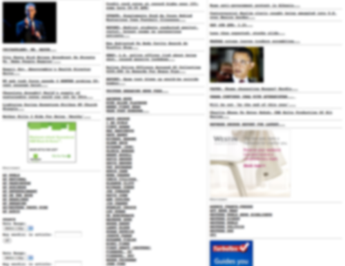
The screenshot above has 2 supporting graphics, 3 advertisements, 2 search/date filter forms, several sections, and a number of links that have different meanings. Breaking this down, the identifiable problems:

  • At a glance, you can’t tell the difference between the advertisements and the supporting article graphics.
  • There’s no easy way to detect where the search/date filter forms are located (hint: lower left corner).
  • All of the links (and sections) have the exact same treatment, but they don’t all have the exact same purpose (news articles, columnists, and content feeds).

Overall this site does a poor job of guiding the user through visual importance. Now let’s look at something I recently worked on.

A Better Example

The situation: in an app I’m working on there is a bit of setup required before the user can dive into the core of what the app does. Since setup instructions are generally a barrier-to-entry, the goal was to make it as easy as possible for the user to get in and out, knowing the exact steps they needed to take.

First, I’ll show where I started: the screen with very little attempt to organize the page. Then I’ll show how I used visual hierarchy and the difference that it made. Here’s the undressed version:
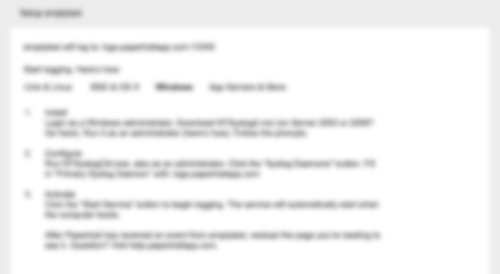
So what’s most important? I bet you don’t really know. Everything seems to be the same. You can see that there is a list, but it doesn’t really indicate that these are steps the user needs to take. It could be a grocery list for all we know (albeit, a wordy one).

Without introducing any color (yet), here’s the same page and content, only this time with an attempt to guide the user using different levels of visual importance:
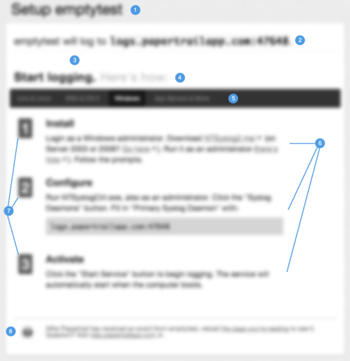
Let’s go through the changes. The numbers on the graphic correspond to the numbers in the list below.

  1. Increased header size to be clear about the item being setup. It should be crystal clear as to what exactly is being setup.
  2. This line needs to speak to the user before anything else, because for experienced users, it could potentially remove the need for the setup instructions altogether. So I increased the font a bit and separated it from the content below using a border-bottom (look closely).
  3. Using nothing but space, I was able to disconnect the upper and lower content sections even more, essentially saying “Read This First”.
  4. This title sets up the purpose of the content below it, so I bumped up the font size and made it bold. Subtext next to it isn’t quite as important, so it’s dimmed a bit (but by drawing attention to the main text, the right text is inherently read, but without the additional noise).
  5. This is a menu of options where each option contains its own set of instructions–it’s incredibly important that the user knows which option they’re on, but above that it’s to illustrate that their are options. Also, this menu was to act as a header to ground the instruction set below it.
  6. Each “step” has a title and a instruction. By bumping up the section title I’ve essentially scoped what the content below it is explaining. It’s important that the user could scan the list just to get an idea of what was involved, then dive into the details. The instruction paragraph was also given more space above/below and increased line-height to help with readability.
  7. These numbers should feel more like “steps” than a list. By squaring them up, increasing the size, and giving some visual depth (contrast), I was able to achieve that. This no longer feels like a wordy grocery list.
  8. The support help/text is important, but it should not get equal attention as the instructions themselves. So by moving it down the page, decreasing the size/line-height, and softening the color, I am basically saying “this is here if you want it, but it’s not quite as important as the rest”. In the rare case that a user needs more help, he/she will be explicitly scanning the page for help information, so it’s less of a concern to make it stand out–it will undoubtedly be found if need be.

When positioning elements on a page I like to work in gray tones first, like the screenshot above. You can do a lot with just contrast and sometimes colors get in the way early on. However, once you achieve a solid foundation on position and weight, color can take the visual importance even further. Take a look at the same screenshot, but in color:
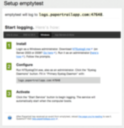
The end result is much better than where I started. It’s now (hopefully) clear to the user that they have a step-by-step process to go through, and (hopefully) each step is clearly defined and explained.

Conclusion

Visual hierarchy is just another tool in the tool-belt, but I believe it’s among the most important. If nothing else, hopefully this helps other designers by at least reminding them to start with the function and flow before the fancy graphics. Nail down the purpose of each page element, and then dress it up.

Happy designing!

On Design Criticism: Out With the Negative, In With the Constructive

Whenever something relatively large launches (like a Facebook update or New Twitter) there are always a slew of “haters” disrespectfully attacking the design from all angles. The problem is blatant disrespect is rarely constructive.

Take the whole Gap logo redesign ordeal. That was a prime example of how not to be. Other designers were mocking the logo with “Crap” (instead of Gap) and being incredibly demeaning toward those who worked on the redesign. It was an awful display of character by so many people.

Currently it seems that the hot, fresh out-of-the-box target is the Mac App Store. For example, take a quote from this response (titled, Mac App Store UI is so hideous that it makes me want to kick a swan):

As expected, it pretty much confirms my thoughts that someone decided to shoot most of Apple’s designers some time around when brushed metal appeared, along with giving everyone at Cupertino a taste-ectomy. The app UI is just hideous, kicking conventions in the bollocks, laughing in the face of clarity, and mercilessly setting fire to UX and pushing it off a cliff.

Seriously? That bad, huh? Even if so, I don’t think it deserves such a degrading response. Nothing does, really. What that quote could have been:

I’m not a fan of the Mac App Store UI. A few common conventions have been broken and the overall experience isn’t as good as it could be, especially coming from the UX experts at Apple. For example, …

That post does go on to make several valid points, but it’s the link-baiting negativity in the title and intro that bothers me. There’s simply no benefit in barefaced negativity toward someone else’s design.

The same thing happens in sports. There will always be fans who get pissed off at a coach for a bad play call, when more often than not, the person complaining couldn’t do a fraction of the job the coach is doing. In sports I expect it, but I really hate to see this behavior make its way into design communities. Every single designer to date has produced crappy work. It’s part of getting better.

It’s challenging to produce good design, there’s no doubt about it. There are many problems to solve within a single solution. But what’s not challenging is to come along at the end and pick out the 5-10% that may be off kilter and run it into the ground because “you could do better”. It’s a different view when starting with a blank slate, I can assure you.

Next time try to remember that there are caring people behind both good and bad design who, in most cases, put a lot of time, thought, and effort into what they do. Maybe they’re not professionals (yet), but they’re trying.

So let’s declare 2011 the year for constructive criticism and we can raise our glasses to better design as a result.

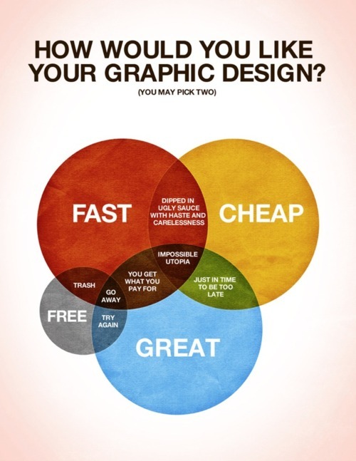
I seem to always reference this concept.

How would you like your design?

Design is not just what it looks like and feels like. Design is how it works.

A quote by Steve Jobs
Freelancers: Are You Billing Clients Like a Lawyer? If So, Stop.

Amy Hoy and Thomas Fuchs just may be the most impressive design & development duo on the internet. Amy’s designs are often so friendly you can’t help but smile and sign up, and Thomas, being the JavaScript mastermind that he is, adds some incredible UI touch.

To give something back, they’ve put up what they call Freelancember, which more-or-less gives advice to freelancers. And the design is the typical excellence we’ve come to expect from them. You should take a look.

With that said, this one kind of surprised me: Top 10 Things You’re Forgetting to Bill For. I just read it, so it’s still sinking in, but it did spawn the urge to write down a few thoughts regarding the topic.

Petty charges feel impersonal. I like to work on cool projects, but first and foremost, I like to work with cool people. People I’d like to be friends with. Putting something like “Copies & Faxes” on an invoice, to me, sends the message: we can never be friends, this is strictly a business relationship and you have to think twice before you give me a call (or send an email)–I’ll bill you for it!

Petty charges are a nightmare to keep track of. It’s hard enough trying to keep track of the time you’re actually working, it’s difficult to fathom recording every moment I think about a project, write an email, talk on the phone, make a copy, etc. Sure, I might be losing out on more income, but I’m not out to squeeze a client for every cent–I’m out to make a respectable living doing great work. That’s what makes me happy.

Petty charges cost more than they’re worth. In general, I think these petty charges cost far more than they’re worth, and not just monetarily speaking. Future work, recommendations, rewarding relationships, and so on are also at stake. People look out for friends, and it’s hard to imagine charging a friend for the gas you used driving to a meeting, isn’t it? Well, that goes both ways.

People like simple. A client would much rather get an invoice simplified down to expected services at a known cost. Mixing in erroneous expenses will add unnecessary complexity. Complexity leads to confusion, confusion leads to asking questions, and asking questions leads to distrust. Sure, you could add a few minutes to your other items, but that feels just as sleazy.

Now, I do understand the point they’re trying to make. If you sit down at your desk from 6pm to 11pm but only seem to accomplish a few simple tasks, it’s hard to eat 4 hours of personal time. There will undoubtedly be discussion, sketching, trial-and-error, etc. and it’s up to you to evaluate the situation. Sketching and productive design work? Sure. Writing up a contract and emailing it to a potential client? Absolutely not. That’s all I’m saying.

Just like I try to treat every project as if it were my own, I strive to treat every client the same way I would like to be treated. I’ve met some incredible people along the way, and have sustained solid relationships with great results. I personally don’t believe I would have gotten here if I billed my clients like a lawyer. Money isn’t the only way to be rewarded, remember that.

So, fellow freelancers: Lawyers can get away with billing that way because society has allowed them to set the expectation, but only another lawyer would think it’s not dirty to charge 4 minutes for an email reply. We’re not lawyers, so we shouldn’t bill as if we were.

While NOT charging for petty things may go unnoticed, I can assure you charging for them won’t. Think about the message you’re sending and ask yourself if it’s worth it.

I apologize for writing you a long letter but I didn’t have time to write a short one.

A quote by Blaise Pascal
Pinboard's Pricing Model

With all of this talk of delicious going away, I too exported my bookmarks and decided to try out Pinboard. Before signing up I noticed there was a price, which I was not expecting. It was only a small one-time fee, worth the money alone just for safe-keeping of my years worth of bookmarks.

But what struck me the most was the fee itself: $6.47. It was kind of an odd number. After looking into it, I realized it’s actually quite smart.

Pinboard charges $0.001 times the number of customers it has, for each new user. And when you think about it, this works on a lot of different levels.

Spam protection. Immediate spam protection because spammers don’t pay. This keeps the system itself clean of spam-checking code, too. And not to mention serious users only. A win right off the bat.

Marketing. The longer you wait to sign up, the more it’s going to cost you. It gives you the “OMG I need to hurry” urge that brings out the impulsiveness in all of us.

Scaling. The more users they have, the more it costs to sign up per-user, hence, the more money they make to keep the service running.

One-time fee. I think most people would be more inclined to pay a larger one-time fee than a smaller recurring charge. It’s closure for customers and simplicity for Pinboard. Plus, even though it’s a one-time fee, the fee keeps going up, so in a way they’re still making money off of their other customers, but without charging them.

And I’m probably overlooking a few other things, but in general, I think that’s a pretty clever way to charge your users.