Thoughts on AI SDLC

I’m blown away we’ve been able to make computers do this. I know it’s “just” algorithms predicting the next token… it could be a word, an exclamation point, or a “haha”. It’s not actually alive, Ryan, right? Right?? It sure as hell feels like someone is on the other end. But that’s the magic. The conversational back-and-forth is what sells you on the future. Of course every input will just be natural language, why wouldn’t it be? When you can speak freely to someone something that happens to know everything or is smart enough to figure it out, doors open up.

But it’s not all rainbows and ice cream. We’re still early on this journey and I have mixed feelings, at least when it comes to the software development lifecycle.


Only Programmers are Programmers

The digital age has put programmers in high demand for a couple of decades now. They were the ones who could turn your idea into something real. Entire businesses are built around teams of programmers making software to satisfy a need. I know, because I’m 25 years into this industry. The promise of AI flips all of this on its head: now anyone can be a programmer!

There’s certainly truth to that, but do we really think that AI levels the playing field so much that decades of prior experience no longer matters? I’m not so sure. Even if AI is doing the heavy lifting, wouldn’t my ideas, questions, and guidance be more effective than, say, my mom’s? Surely it would!

It can definitely deliver results in all cases, but it still feels like I’m seeing far better AI output from programmers over designers, product owners, project management, etc. And I have to think that’s because of who’s in the driver’s seat.

Code is Art

When I’m writing code, I’m also focused on the elegance of programming. Coming up with clever ways to build things is addicting. The problems often weren’t the hard part, the challenge was solving them in the cleanest, most simplistic way. Sure, I bet that led to a bit of overengineering in my day, but the point is I cared deeply about code quality and the act of producing it. It’s why programmers like to write “idiomatic” code in their language of choice. The non-idiomatic version still works, but there’s way less satisfaction.

Manually working through business logic/requirements, designing a scalable data model, writing shared modules/packages/plugins, crafting APIs… it’s a beautiful and rewarding experience. With AI, context bloat is a real problem and it makes choices based on what it can reason about within that context window. Hallucinations happen and sometimes the quality slips. Ultimately, the sad reality is that AI demands I trade productivity for the creativity, art, and joy of programming as it once was. Maybe it’s nostalgia, but I already kinda miss it.

Speed, Speed, Speed

In golf, you don’t pick up club speed from swinging as hard as you can. In fact, it’s often the opposite. Improved technique is what gets you that bump in speed. You don’t have to improve your technique and swing as hard as you can. It’s counterproductive.

Enough metaphors. In software, the speed boost is real, but it’s not enough! A 30% boost in speed could be a 50% boost in speed if we can crank out code reviews even faster! AI can write your commits! AI can create the PRs!

We need to take the gains where they come, where it makes sense and not force all things, in all ways, to adopt AI because of speed, speed, speed. Keep the best practices you’ve learned in place and utilize AI to improve your technique. Iterate your way through it.

Anyone Know How This Works?

The really good programmers know how their stuff works. What I’m seeing more and more are engineers who are a little unsure. The PRs are written with AI and code review questions are answered with AI. So who’s the expert? Maybe I’m being grumpy about this, and the actual answer is: “who cares, because Claude will fix the problems, anyway”.

As long as there are on-call rotations in software, I’m really hesitant to let that human knowledge start fading away.

Spec-Driven Development

We’ve been building features with SDD for most of 2026 now. It’s a powerful tool in the toolkit. Planning, speccing, and tasking the work into phases is exactly how you get reliable results with very limited hallucinations. Our tooling allows us to build features across many repos. We orchestrate a swarm of agents to do planning, implementation, code reviews, and testing. Certain models are good at certain things. We take advantage of that.

But.

This is a big workflow with a lot of artifacts to review before any agents do work. Not all features are big features. So we’re still hunting for the middle ground, because most of the time this feels a little heavy-handed, somewhat overengineered.


Let’s reset. That all felt a little negative… what do I like about this brave, new world?

Refactoring Made Simple

When you work on software with a lot of contributing teams it’s inevitable that you’ll end up with things that should’ve been done better. A decision deemed temporary is now baked in pretty deep. And with a handful of Product folks sorting the priorities, going back to fix it never makes the list.

But now, you can spawn a team of agents to untangle that mess. Tech debt is often ugly, but it usually comes with one benefit: you know what’s wrong with it and you know how to improve it. That’s a great recipe for steering AI toward good outcomes.

Exploration

Before AI, the ideating often happened in a proposal. It was theoretical, “here are the options”. But now? You (or “you”) can build proof-of-concepts in a matter of minutes. I’m old school, so I often like to design in the browser. It always made sense to me to explore ideas under the constraints and limitations of the stack, on-screen rendering, available components, etc.

AI makes this workflow so painless and you get to feel what customers will experience. This was always a much more effective way to explore ideas, it was just too expensive before. This is probably my favorite thing the technology affords.

Planning

A main way I use AI is to help me plan or ideate on a feature. As I mentioned above, these are those magical moments when I get lost in “conversation” and forget I’m not talking to a colleague (let’s ignore the societal impacts of what I just said, though). Tossing out ideas that push past what you’d normally consider is useful, and AI makes that really easy to do.

Of course I don’t blindly trust the output, but I do find value in sanity checking my ideas or approach against something that can look into every dark corner of the codebase and help keep me in check.

Gone is the Mundane

Easy and boring things are just gone. It started with automated tests, you get those for free now. But aside from that, there are many parts of a feature or application that you work through on your way to the good stuff. Often, you know exactly what needs to happen on those boring parts, and AI can really shine when you give it clear direction. It frees me up for the more interesting parts of my job, and I appreciate that.

MCP & SKILLs

MCP is a protocol that many services support. It expands what your AI knows and what it can do by tapping into third-party systems you use. AI interactions can be pretty great regardless, but when they can see beyond that baseline, it really is a game-changer.

SKILLs are agent instructions for specific—perhaps routine—things. You define a scoped set of context, tell the agent how to behave, describe when and why to use it, and the AI decides when the time is right during normal interactions. You can also call them explicitly, of course.

I’ve found that a solid CLI + SKILL combo is as good or better than MCP integrations, and they’re often easier on the token consumption, but that’s for another post. All of this is to say that you have to take the time to properly hone your setup for the best experience, and MCP / SKILLs are a huge part of that.

Conclusion

Admittedly, I struggle to hand full control over for AI to go crazy and build my feature. That doesn’t mean I don’t rely on AI routinely (I do), I’m just more intentional about when I bring it in. It’s AI-assisted development. I’m in control, I guide it, I determine what I don’t care to write and what I do. I still focus on small PRs, small changesets. I think many people approach it this way, but definitely there’s a camp of people whose AI trust meter is maxed out and they set it loose on their code. I’m not there yet.

I don’t know where all of this is going to go. I don’t know what it’s going to mean for the future, both in tech and for my kids, but we have a technology that’s fundamentally changing everything, and it’s improving by the day. Natural language is the future interface.

We like to complain and throw our hands up at the faults of AI, humans (engineers especially!) are hilarious in that way. But I do think it’s worth taking a moment to marvel at where we are. It really is incredible. And scary. We’ll see!

Onward.
Using a Telephoto for Landscapes

This is not a fresh concept, but it does open up a new world of opportunities if you haven’t tried it. The idea is that a telephoto lens can help you pick out little details within a larger scene. Suddenly the weather matters a lot less, and you’ve got far more to shoot.

When it comes to landscape photography, most people (especially early on) think about the “grand landscape”. They’ll throw on some kind of wide angle lens and try to capture everything they see in one frame. Those photos can be incredible! But this kind of photo often depends on a setting sun, clouds in the sky, blue hour, a storm, or some real help from the weather. Otherwise it’s kinda blah.

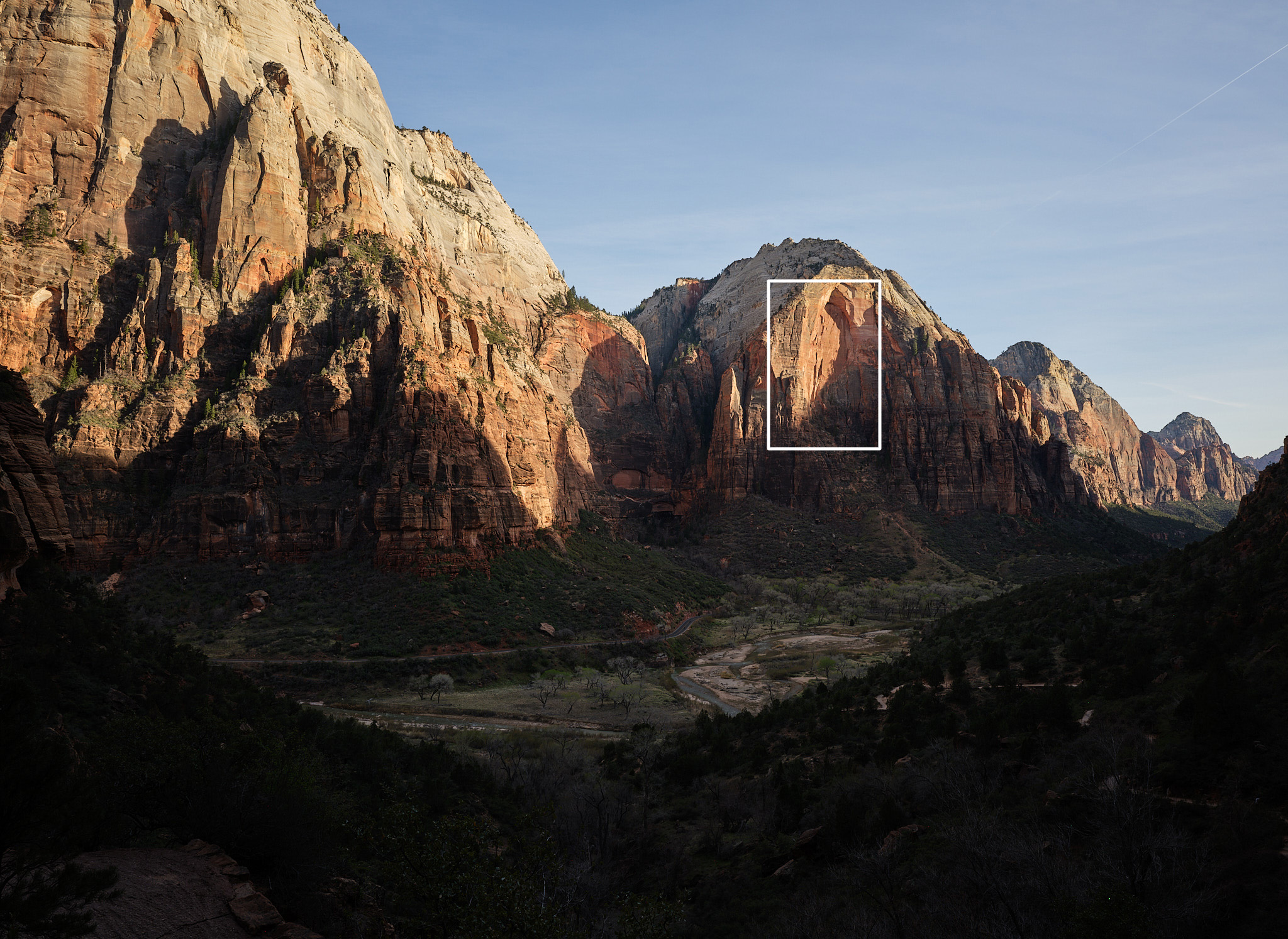
Take this photo for example:

Scale

Kinda blah. This was more of a “remember the moment” photo (i.e. the view from the lower part of Angels Landing in Zion), but you get the idea. This was shot with a 35mm lens — pretty wide — and captures the “grandness” of the scene.

However, within this photo, there are many smaller scenes — you just have to find them. Continuing with the example:

Scale

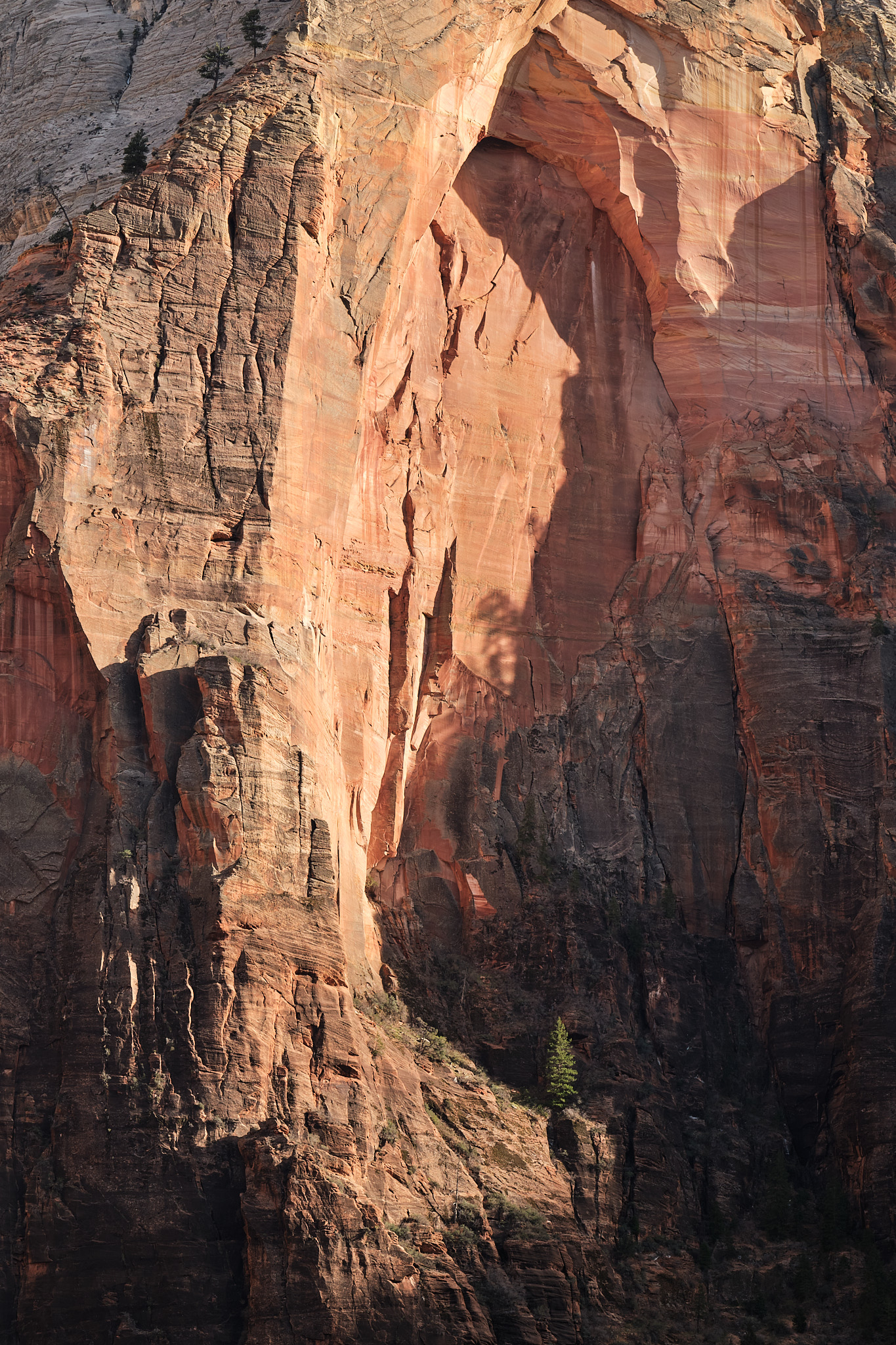
Where’s Waldo? Using the original photo, can you find where this one came from?

The overall light wasn’t magical on the grand scene, and the sky was a flat, cloudless blue, but within that scene there were many nice pockets of light. Here, the pine tree in the lower half is isolated out of the shadows, with a surrounding “arch” framing everything. For me, this is a bit more interesting. To help emphasize the point even further, here’s the view I had with my own eyes vs what my 100-400mm (all the way out to 400mm) was picking up:

Next time you’re out shooting landscapes, make sure you take more than just a wide angle. Using a telephoto will help train your eye to see all kinds of new opportunities and help you build a more diverse collection of photos.

Changing Views on AI

I’ll admit, I spent a long time criticizing AI tooling, perhaps a bit disappointed with what the future looked like. I know many people who were ecstatic about all of this, all-in from day one. But it always felt different for me. Part of my love for programming came from designing and writing beautiful code. Or at least, striving to design and write beautiful code. Most of my career I was reaching for that “craftsman” status. I believ(ed) in that. Code is creative. Code is art.

Then came AI. In the beginning it was laughable, zero threat. But it was clear where we were headed. As it got better and better, it began trying to rip that “craftsman” mindset away from me. It’s hard to pinpoint what I was bitter about, though. Was it because it (seemingly) “leveled the playing field” so all of the decades of hard work I had put into building software no longer mattered? Maybe. I realize that’s a goofy way to think, but I take a lot of pride in my work, and pride is funny like that.

But—sometime last year I moved through the stages of grief and started accepting my fate. This was the way. So at the beginning of 2026 I really embraced what it could do for me. I tried to think “AI-first” with most things I had to do. Lots of experiments, running local models, lots of reading, learning, and adapting. I was a tinkerer again.

The result? It kinda paid off. I have workflows now that I couldn’t imagine doing manually anymore.

I think my fears and dread all stemmed from AI replacing things. If I no longer designed the solutions to solve my problems, then what am I? Just a “prompter”? Blah. But that turned out to be so far from the truth, at least for me. What I realized very quickly is that an AI-assisted workflow provided peak productivity gains and still left me with all the control I wanted. And a bonus on top of it all: the better the engineer, the better the AI output. Which means experience, knowledge, preferences… all still matter.

While I’m still unsure how happy I am about the future, it’s at least a lot less bleak. Engineering is still about best practices, tradeoffs, and adapting to the ever-changing shifts in technology. This particular shift just took a lot of intentional effort and acceptance before I could thrive in the new world. But I’m here now, embracing it, keeping my fingers crossed along the way.

Querying APIs with Vanilla JS

I’m at the point in my career where keeping things simple is a top priority, even if that means a little sacrifice in other areas. In this particular case, as part of redesigning rpheath.com, I wanted to pull in the latest N posts from this blog. Given that I’m working with a static site, that meant using JavaScript. A young whippersnapper may immediately turn to React, Vue, Svelte, or (gasp!) Angular, which is reasonable. Those frameworks make this type of thing clean and easy. But I did not want to deal with integrating webpack and/or babel into my builds, as I’ve been down that road plenty, and it’s (shockingly!) still pretty annoying to deal with. Besides, each redesign of my personal site strives for more and more simplicity, so that would go against the grain.

I chose to use vanilla JS for this. Let’s talk about it! It all starts with a fetch-based function to grab the data from the blog’s API:

1function fetchPosts(url, callbackFn) {
2  fetch(url)
3    .then(response => response.json())
4    .then(data => callbackFn(data))
5    .catch(error => console.error(error));
6}

The fetchPosts() function grabs data from an API and hands it over to a callback function that I define for processing. This is all so simple because fetch() is built on the Promise, which in modern JavaScript, is an expectation for asynchronous calls.

Since we don’t have a framework to do stuff for us, the next “problem” we need to take care of is ensuring that our code runs at the right time. Meaning, after the DOM has loaded. Old school folks may remember jQuery’s $('document').ready(...) or $(function() { ... }) helpers! Yeah, it’s that, but with vanilla JavaScript. There are two ways to approach it:

 1// (1) wait for the DOMContentLoaded event
 2document.addEventListener("DOMContentLoaded", (_e) => {
 3  console.log("The DOM is ready!");
 4});
 5
 6// (2) a self-executing function
 7(function() {
 8  console.log("The DOM is ready!");
 9  console.warn("...but only if this JS is included at the bottom of the page");
10  console.warn("...also, I ignore deferred scripts!");
11})();

Both work, but notice the caveats with option (2) above. If you go with a self-executing function, it’ll execute whenever the browser reaches it, so it must be after your HTML is parsed, top-down (and even then it still ignores deferred scripts). We’ll go with option (1) for our purposes.

The next bit to work out is what to do with our data once we get it back from the API. In React, for example, we’d make a component that spit out some HTML for the browser. Well, that’s exactly what we’ll do, only we’ll use JavaScript’s Template Strings instead.

 1const renderPosts = (data, container) => {
 2  let posts = [];
 3
 4  data.forEach((post) => {
 5    const html = `
 6      <div class="post">
 7        <div class="post-date">
 8          <time>${post.date}</time>
 9        </div>
10        <div class="post-link">
11          <a href="${post.url}">${post.title}</a>
12        </div>
13        <p class="post-caption">${post.summary}</p>
14      </div>`;
15
16    posts.push(html)
17  });
18
19  container.innerHTML = posts.join("\n");
20};
21

I bet any youngsters who stumble onto this won’t even know what innerHTML is. But essentially, we just take the data and iterate over the response, creating an array of string-interpolated items. Once we’re done “looping”, we just set the container’s HTML to render our posts.

It’s a nice touch to put some kind of default text or loading indicator into your “container” element:

1<div id="blog-posts">
2  [spinner svg] Loading Posts...
3</div>

Then once the DOM loads and your function executes, innerHTML will replace your loading content with the interpolated response from the API.

Now that all of our pieces are in place, the result looks like this:

1document.addEventListener("DOMContentLoaded", (_e) => {
2  const blogContainer = document.querySelector("#blog-posts");
3
4  // we only want to do this for the "blog" section of the site
5  if (blogContainer) {
6    fetchPosts((response) => renderPosts(response.data, blogContainer));
7  }
8};

You can see this in action by going to rpheath.com/blog.

The important lesson here, if there is one, is to avoid defaulting to complexity because “that’s what the internet does”. If I wanted to use React for this, I totally could, and the outcome would look very clean and satisfying. But the complexity involved with integrating React into my builds was just not worth it. I have the same result, but with zero configuration or headache. I’m just using what browsers already know and understand. And for me, that’s the reward.

A Personal Site Redesign

Every so many years I do a redesign of my personal site, rpheath.com. Things go stale, technically, so I clean that up and typically put a fresh coat of paint on while I’m at it. Given that I’m usually working to satisfy other people, it’s nice to work on something where I’m the only stakeholder. Ahh, creative freedom.

Something I wanted to bring back to this redesign was a bit of “fun”. Remember CSS Zen Garden? The idea was all about showcasing the power of CSS and how it could transform the same HTML into completely different designs. It got me thinking… Why does my personal site need to adhere to the same design on every page? After all, it’s not a product, it doesn’t have “users”. So that’s what I did. Each page represents its content in its own way.

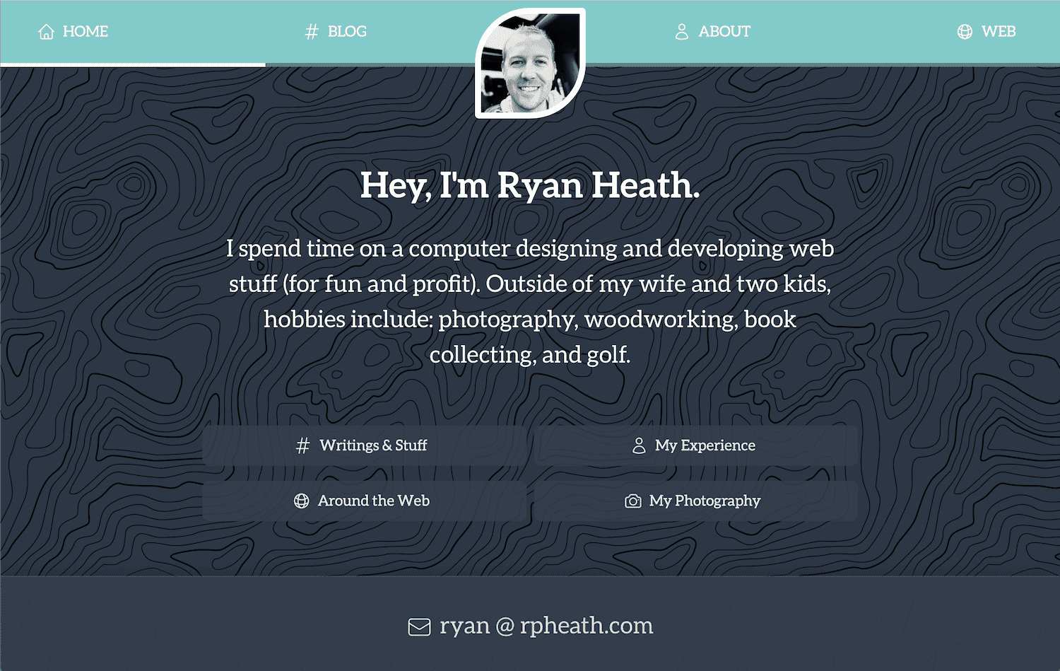
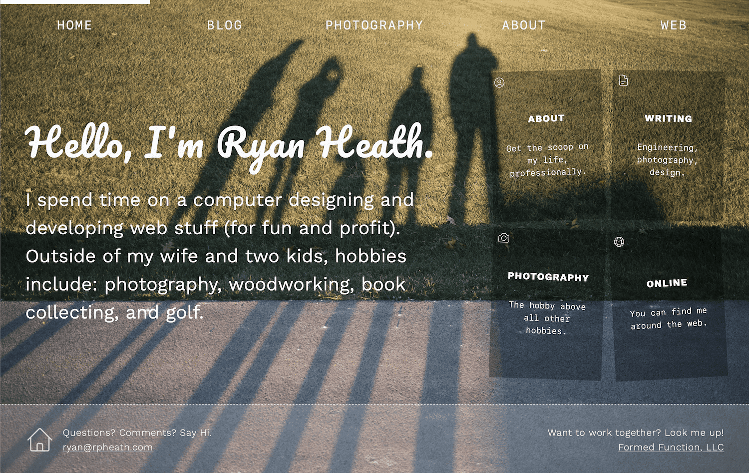
I don’t know how long I’ll live with these changes, but as of today, I’m digging it. Here’s a before/after glimpse of how it turned out, but you can browse for yourself at rpheath.com.

BEFORE

AFTER

Comments are off, but if you really want to share your thoughts, try ryan@rpheath.com.

Pairing Photos

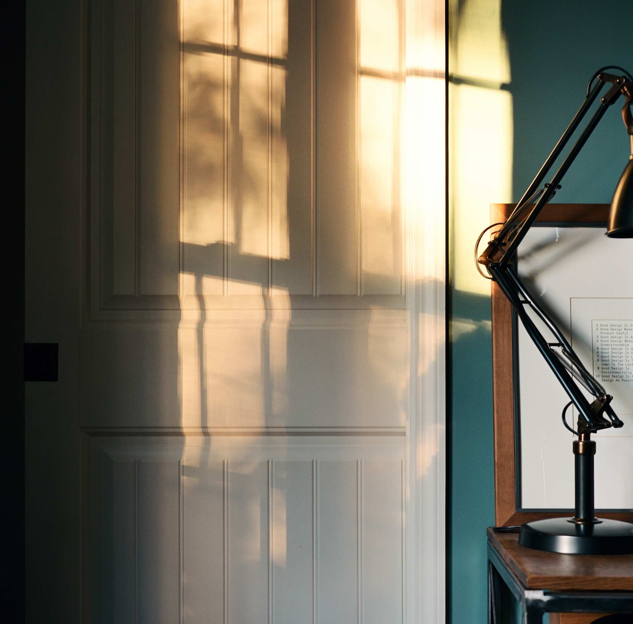
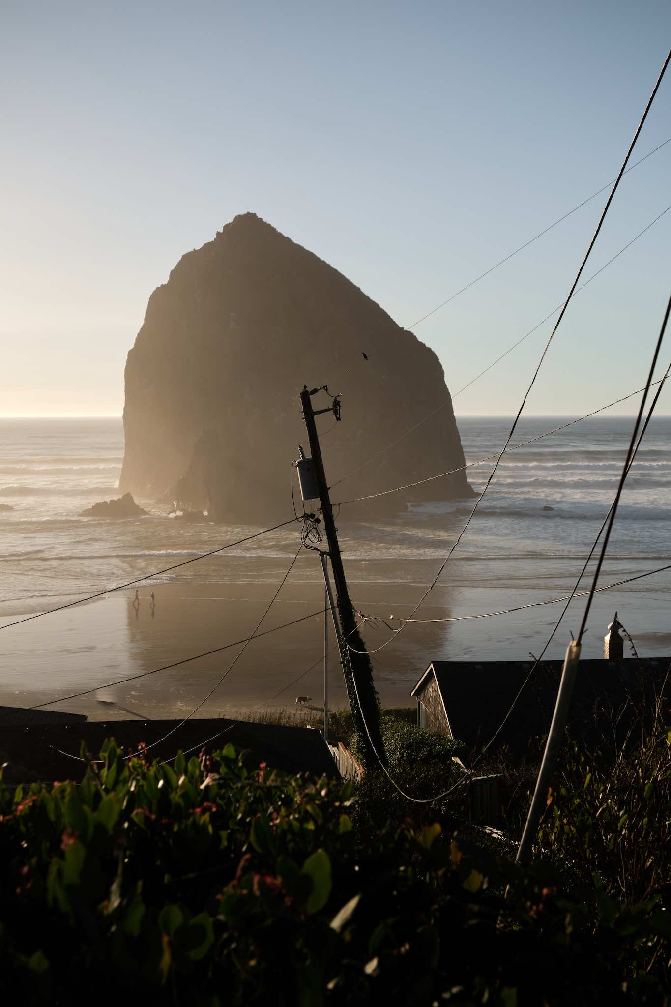
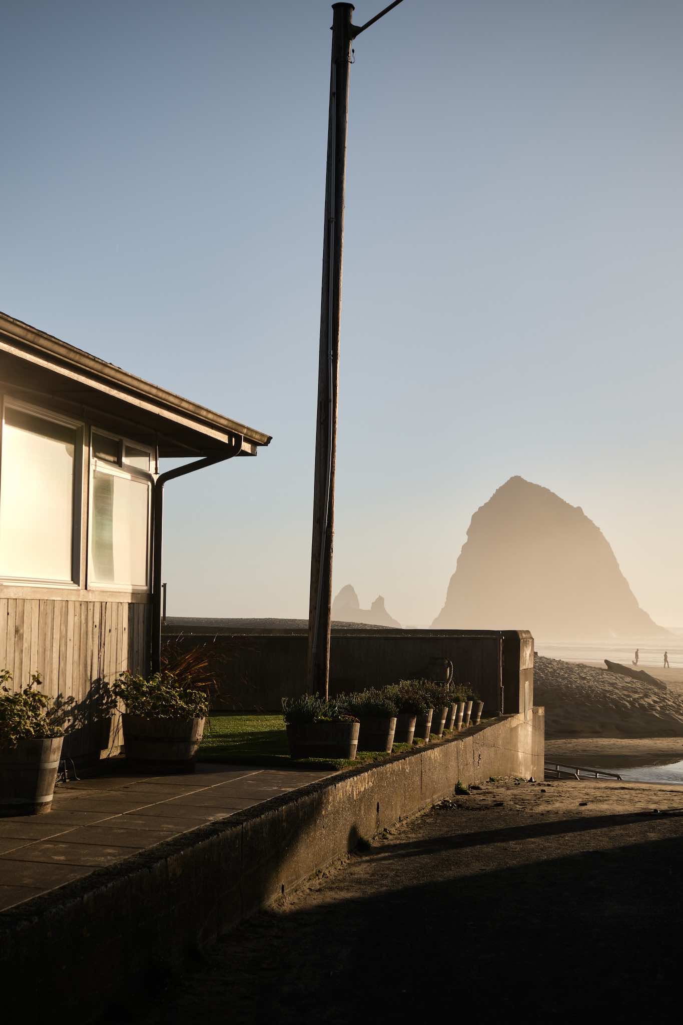
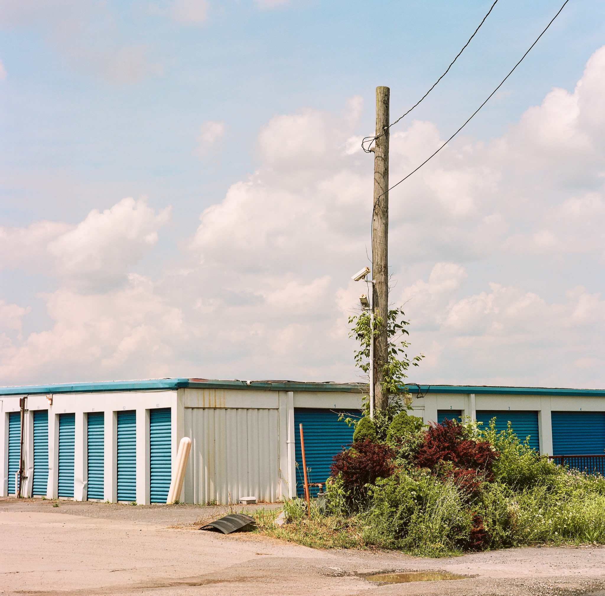
One of the things that took me a while to learn was the impact photos can have when represented as a pair. I’m generally not one to talk about “story telling” with photography (even though I believe in it), but when it comes to pairing photos, I think the story can be laid out so much better.

Take the pair of photos above, for example. Individually, they’re pretty “meh”. You get the idea, there was some nice light making shadows. But with two photos? Now you start to see the full “story”. At least I do. I can visualize this light coming through every window of the house, making shadowed shapes all over the place. The impact is double for me.

Again, another set where the individual photos are solid, but together have greater impact. Haystack Rock is massive, it’s right on the beach and everyone has seen so many photos of it from that perspective. But there’s something about showing buildings and houses that tell the full “story”. When you see one of these, maybe it’s just an anomaly. But when you see two? Then it’s like, okay, this rock is literally right in front of all these houses. At least, that’s how I think about it.

In this last example, these photos don’t even really make sense. I don’t know if there’s any “story” here at all. But that’s kind of my point: sometimes a pair of photos just look better, together. I personally really like these two, but mostly because they’re next to one another. Maybe it’s the colors? I don’t know, Portra is magical. But I do know that I like them a lot less when I see them in isolation.

So there you go. Pair your photos, it’s another trick in the bag to get more out of your photography.

Shooting Film: Mamiya C330

I knew when I finally started shooting film that 35mm would just be the gateway drug into something else. But I didn’t expect to find what I found, and I didn’t expect to love it as much as I do.

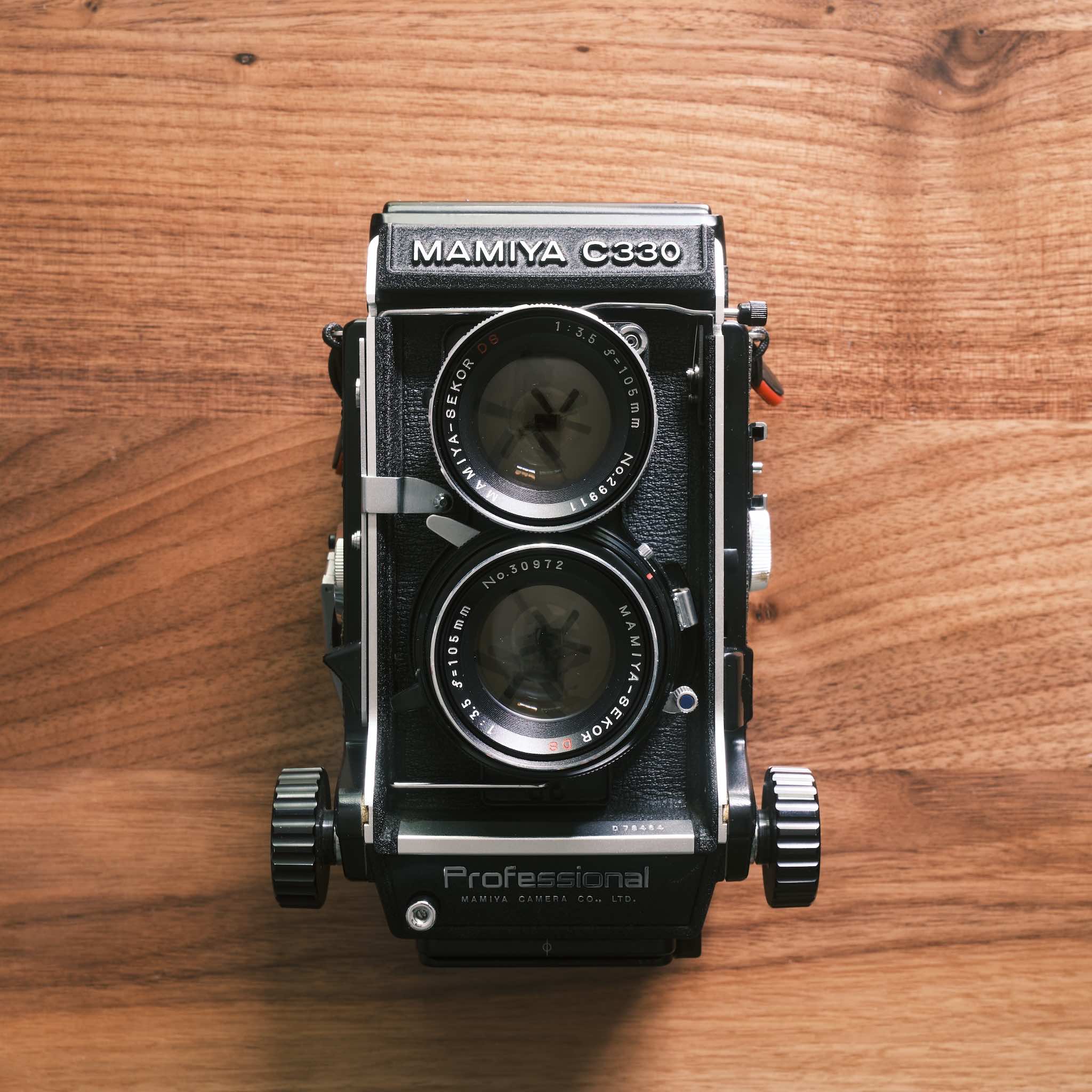
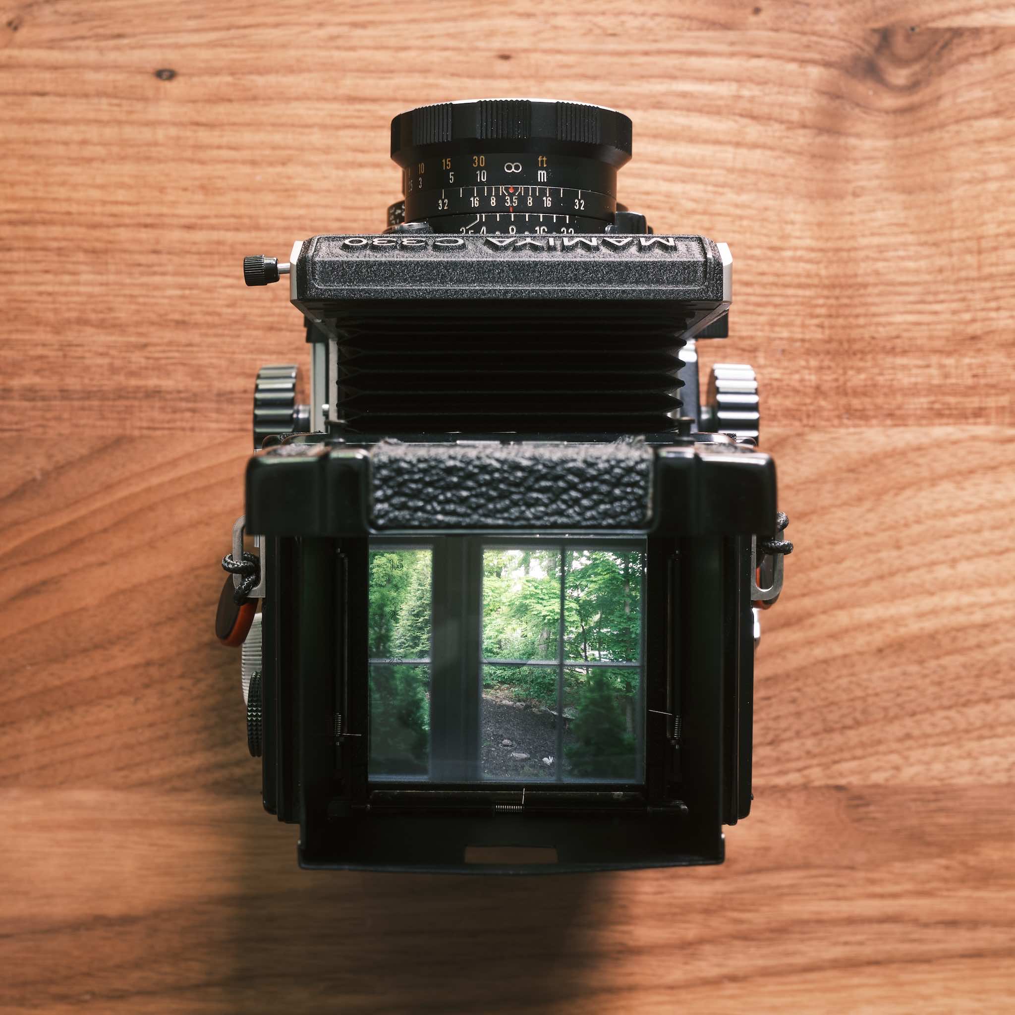
The Mamiya C330 is a medium format film camera that shoots 120 (6x6) film. It’s a twin-lens reflex design, where the top lens is used for focusing, and the bottom lens takes the photo. It focuses via bellows extension and can get almost macro-level close. You turn the knobs on the sides to move the bellows in and out.

Scale

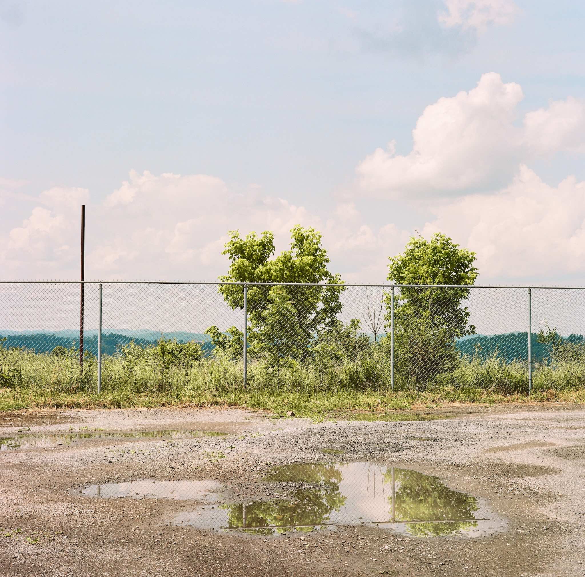
Golden hour at a Go-Mart / storage unit parking lot

The top of the camera flips open and you look down at a viewfinder to focus the scene. There’s also a magnifying glass built-in that’s optional, but when you enable that, you can really dial in your focus. This all sounds kind of nuts, I get it, but it actually works really well. The Rolleiflex is one of the more well-known TLR cameras, but it’s expensive. Additionally, it doesn’t allow swapping lenses, which you can do on the C330. I only have one lens (a 105mm), and don’t plan to buy another, but I could.

For a camera that’s 55 years old (at the time of this writing), the photos I’m able to get out of it just blow me away. I bought this camera on eBay for about $300 (including the lens).

It’s heavy, awkward, and extremely slow to use (fully mechanical, no light meter), but it has given me a new perspective on photography. When I flip through photobooks that were made using large format cameras, for example, I now have a greater appreciation for the work that went into each frame. And while it’s so different from digital, and in many ways, “not worth it”, there’s no greater feeling than composing a scene, pressing the release cable, and finding out that you made a perfect exposure. It’s a very rewarding experience, end-to-end.

Shooting Film: Bessa R2A

There was a time when I simply could not understand what the appeal was when it came to film photography. It always intrigued me, but I was never certain that I had the patience for it and the overall process just felt so… pointless? But here I am. Years later, I have a different perspective. I recently picked up a 20+ year old, used film camera.

Scale

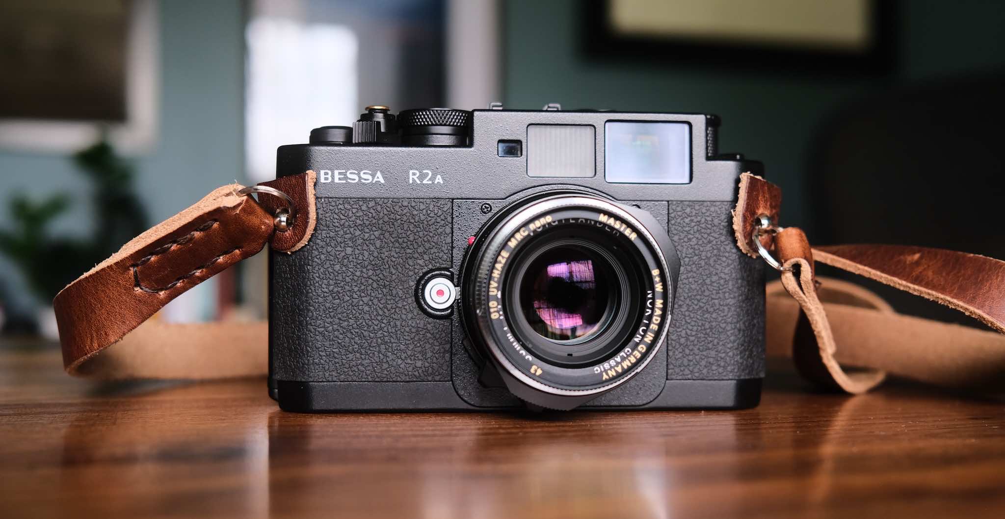
Voigtlander Bessa R2 w/ 35mm Nokton Classic f/1.4 II

Right off, this camera is beautiful! And if you know me, I can’t dare use a camera that doesn’t align with my aesthetic tastes.

I’m not a product review kinda guy, but it’s worth noting a few things that make this camera special:

  • The largest framelines are 35mm, which is what I plan on shooting with this camera.
  • I shoot aperture priority, which this camera has! (along with +/- 2 stop exposure compensation)
  • The rangefinder patch is excellent, despite the camera being old-ish.
  • It’s a M-mount, so I can use my existing VM lenses.

There’s a bit of anxiety that comes along with shooting film, but it does seem to make you hone in on what you’re doing because you can’t make “test exposures” to verify anything. If you over expose a scene on purpose, you won’t know if you blew those highlights until you get the film back. You’re forced to understand how different films react to light and be a lot more intentional up front, which I (so far) am enjoying.

Another thing I didn’t really think about: you sort of choose your “edit” up front. Sure, you can make small adjustments to the scans in post-processing, but for the most part, you’re choosing your colors, contrast, and overall feel up front before you head out with your camera. That’s kinda cool and very different for me.

We’ll see how this whole thing plays out. I’m still a digital shooter at heart (if nothing else because of the cost of film, sheesh), but I will say, the feeling I get when cranking the film advance after every shot is pretty addicting.

Anyway, I find that hobbies—including photography—require you to “keep it fresh” to stay motivated and inspired. Right now, for me, that’s the Bessa R2A. Wish me luck!

Composition Tip: Scale

Let’s get to it: When you’re shooting something big, think of ways to show its scale. Scale is a powerful composition trick that adds impact to a photo. When properly done, the viewer can feel like they’re in the scene vs looking at the scene.

Scale

100mm, f8, 1/1300, ISO 125

There’s nothing special about this photo, but I intentionally waited for this gliding bird to be in the scene solely because of scale. I think having that tiny bird in there shows how large the cloud actually is, as well as the rainbow.

Now, this is just a photo of some random clouds, so perhaps it’s a poor example. But imagine if this were a massive waterfall? Or a mountain? By itself, it would be a nice photo, but the viewer may not be able to comprehend actually being there. Now, if at the base of that waterfall or mountain were a tiny car, or person, or tree, or… you get the idea. The photo would feel completely different. And overall, isn’t that the goal? Make the viewer feel something (good or bad)?

Next time you’re out shooting, keep this in mind: for grandiose scenes, the impact and drama of your photography can be greatly improved if you’re considering scale.

Photographing the Moon

It seems like it should be really easy to photograph the moon, right? And I guess it is, but there are a few things to be aware of for a frustration-free experience.

Moon

560mm (400mm w/1.4x teleconverter), f8, 1/250, ISO 800

Reach!

Depending on what you’re after, it helps to have a long lens so you can do one of two things: fill the frame and/or take advantage of compression against a foreground subject. Have you ever seen those photos that look fake, where the moon is gigantic behind a… lighthouse, for example? Yeah, that’s what telephoto compression does.

A 100-400mm is a great lens to have for a lot of reasons, but can work well for moon photography.

No IBIS

Given you’re at such a long focal length, you’re probably going to need a tripod. And when you’re on a tripod, IBIS can actually have the opposite affect on your photo and cause camera shake. Although, if it’s windy, you can (maybe) consider keeping it on. The point here is to be aware that this is definitely something to think about.

Fast Shutter

Believe it or not, the moon moves very fast! Even a 10s shutter speed could result in soft images due to movement. Additionally, the moon is very bright, so you want to be careful to not blow out the highlights to the point of no recovery. I typically start with 1/250 and adjust from there.

Manual Mode

You want full control over your camera when photographing the moon. This means controlling aperture, ISO, shutter, and focus! It seems like you should be able to autofocus on the moon, and sometimes you can, but the dynamic range is often so extreme that your camera could get confused. It’s just easier to give in and go full manual.

Keep It Simple

It’s very easy to forget things in the moment when on location, so a simple rule that can get you close is to match your shutter speed with your ISO. If you shoot 1/250 then use an ISO of 250. If you shoot 1/1000 then use an ISO of 1000. It’s not always perfect, but it gets you in the ballpark where you can properly tweak from there.

Plan!

Buy PhotoPills. If you do any kind of landscape photography consistently, you will want this app. You can easily see when the moon rises, where it’ll be, what time you need to be where, etc (plus it has sunrise/sunset, milky way, AR mapping, and so much more).

Epic shots require a little thought ahead of time, so don’t ignore this step.

And finally, have fun!

Riona Buthello

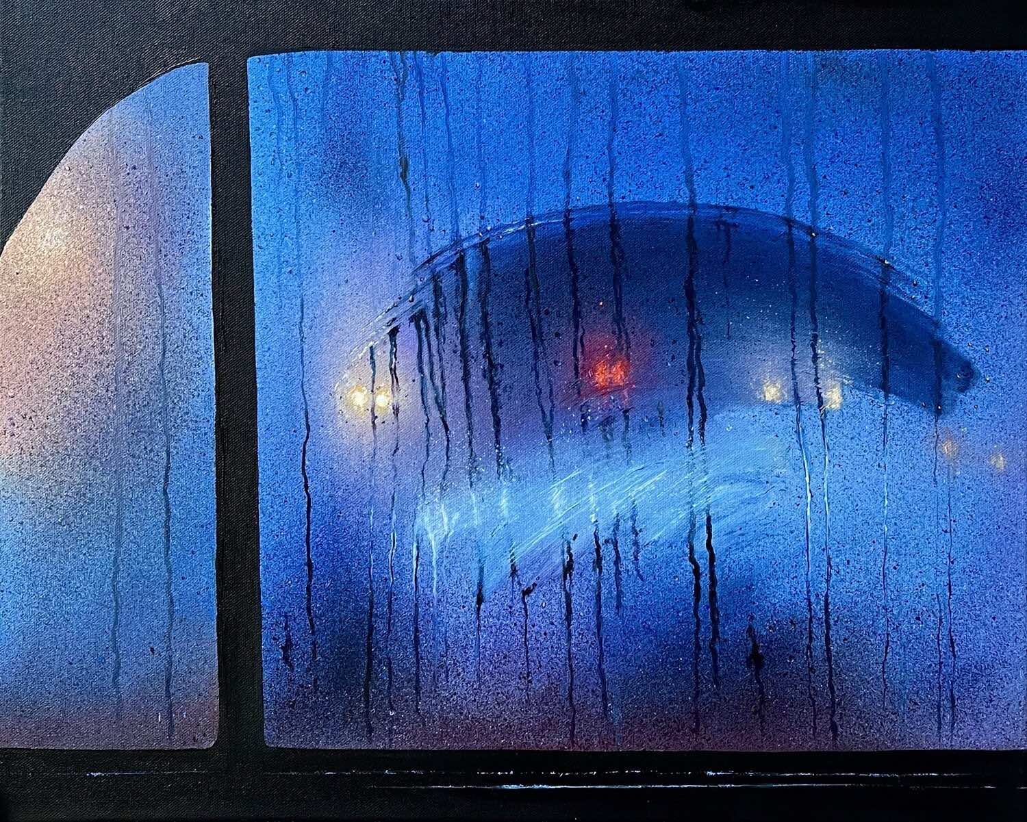
I grew up drawing and painting almost constantly. These days my “creativity” comes out through photography. But when I stumbled onto Riona Buthello’s work, I’d found something that combined the two.

Riona Buthello

Like, c’mon. Incredible.

Many artists paint things that look like photographs, or attempt to, but there’s something about her style that aligns perfectly with my tastes. I strive to take photos of these exact moments.

From her site:

My work tends to make people stop and wonder whether they’re looking at a photograph or a painting until they see these slight textures in my work.

I would say she nailed it.

I recommend following on Instagram, too, for the video clips — it comes to life so effortlessly.

Infrared Sensor Conversion

I recently had the sensor in my old Fujifilm X-T3 converted to infrared (720nm). I used Kolari Vision for this, which involved sending the camera off for a few weeks. The result is exactly what I had hoped for!

The cheaper alternative is to use lens filters to do this on top of a normal sensor, but they knock out 6-10 stops of light, which means you can forget hand-held shooting. Everything must be stood up on a tripod, which is fine, but kind of limiting. So I opted for the full, permanent conversion.

Infrared Parking Lot

It’s been a blast so far! Seeing the world through infrared opens up a ton of new photographic opportunities. It’s tough dedicating a camera to this permanently, but since that affords me normal shutter speeds and accurate autofocus, I have no regrets.

Oh, and a bonus: infrared photography works best in mid-day, blue sky, full sun situations (which is otherwise a photographer’s nightmare). So now I’m able to shoot 24/7, no excuses!

The Proactive Engineer

I’ve been a young engineer, mentored young engineers, and now I manage (some) young engineers. One of the best perspectives a young engineer—or any engineer—can have is being proactive.

Engineering is complicated. There are often multiple teams and departments coinciding with ever-changing requirements. This can provide engineers with a tempting out (or “pause button”) when working on a problem because they feel blocked on some level. Does something like this sound familiar?

We can’t work on that yet because there’s no API.

Quite often, though, there’s more an engineer can do than claiming blockers. With minimal additional effort, let’s see how much more helpful a response like this might be:

We can’t work on that yet because there’s no API. But I spent some time thinking about what inputs and outputs we would need to properly build X feature, and wrote up my notes as a proposal for the backend team’s consideration.

Makes a difference, right?

It’s easy to throw things over the fence. It takes intentional effort to avoid it. But when you do, that proactive mindset can go a long way within a team and helps nurture a problem solving culture. It’s not about you, me, or them. It’s about solving a problem and helping everyone involved come up with the best outcome for the situation.

We all want to work with helpful, caring individuals… a proactive brain can help convey that to others.

Setting Ownership in Rails

There’s a common pattern in a lot of applications to track who did what. Who created this post? Who was the last person to update it? Maybe it’s for accountability, maybe it’s because your client is nosy.

There are gems for this, but it’s such a simple thing, that extra dependency isn’t really worth it. So let’s take a look at a pretty simple way to achieve this in Rails 7 using a concern:

 1module Ownership
 2  extend ActiveSupport::Concern
 3
 4  included do
 5    before_validation :set_ownership
 6
 7    scope :created_by, ->(user_id) {
 8      where(creator_id: user_id)
 9    }
10    scope :updated_by, ->(user_id) {
11      where(updater_id: user_id)
12    }
13
14    belongs_to :creator, class_name: 'User',
15      foreign_key: 'creator_id', optional: true
16    belongs_to :updater, class_name: 'User',
17      foreign_key: 'updater_id'
18
19    validates :creator_id, :updater_id,
20      presence: true
21  end
22
23  private
24
25  def set_ownership
26    current_user = Current.user
27
28    if new_record?
29      self.creator_id = current_user.id
30      self.updater_id = current_user.id
31    else
32      self.updater_id = current_user.id
33    end
34  end
35end

Now, for any model that has creator_id and updater_id columns, you just have to include the Ownership module:

 1class Post < ApplicationRecord
 2  include Ownership
 3
 4  # ...
 5end
 6
 7>> @post = Post.find(1)
 8>> @post.creator
 9# => #<User id: 10 ... >
10>> @post.updater
11# => #<User id: 20 ... >

And whenever a Post is created, the creator is automagically set; similarly, whenever any Post is updated, the updater is automagically set. This, of course, assumes your application has user sessions, since you obviously need to know who’s logged in doing the creating and updating.

Cinebloom Diffusion Filters by Moment

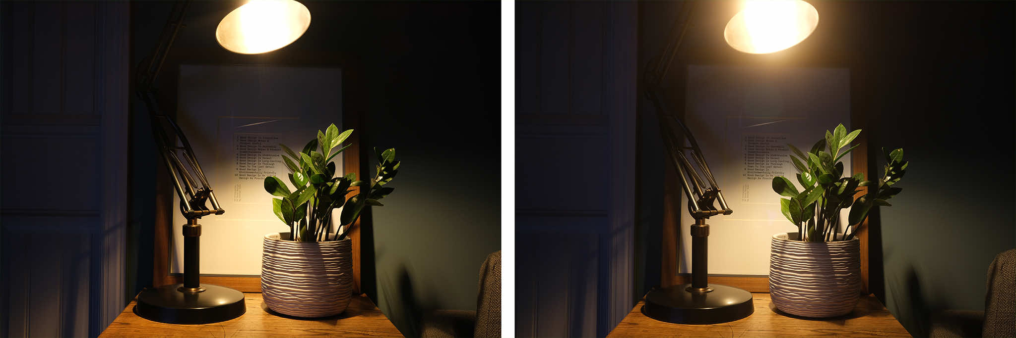
I’ve had a cinebloom diffusion filter (10%) on my X100V for about a year now. If you’re not sure what a diffusion filter does, Moment’s site says it best:

The CineBloom Diffusion Filter takes the edge off your digital sensor. It not only catches and blooms light, but softens hard edges and has a smoothing effect on skin tones, making wrinkles less noticeable. Escape the clinical, ultra-sharp look of digital with this specialty glass.

While I’m someone who thrives on sharp images, for the 10% filter at least, I haven’t noticed a sacrifice in sharpness. Here’s a sample with (right) and without (left) this filter:

Comparison

It’s subtle, but it’s there.

This filter pairs really well with the output of the X100V, straight out of camera. Here’s another photo looking straight into the sun while my dog, Penny, is racing back and forth between my wife and I.

Penny

Again, the X100 series already produces stunning photos… but if you’re itching to mix it up a little bit, a cinebloom filter might be just the thing.

Compositions Using ViewCatcher

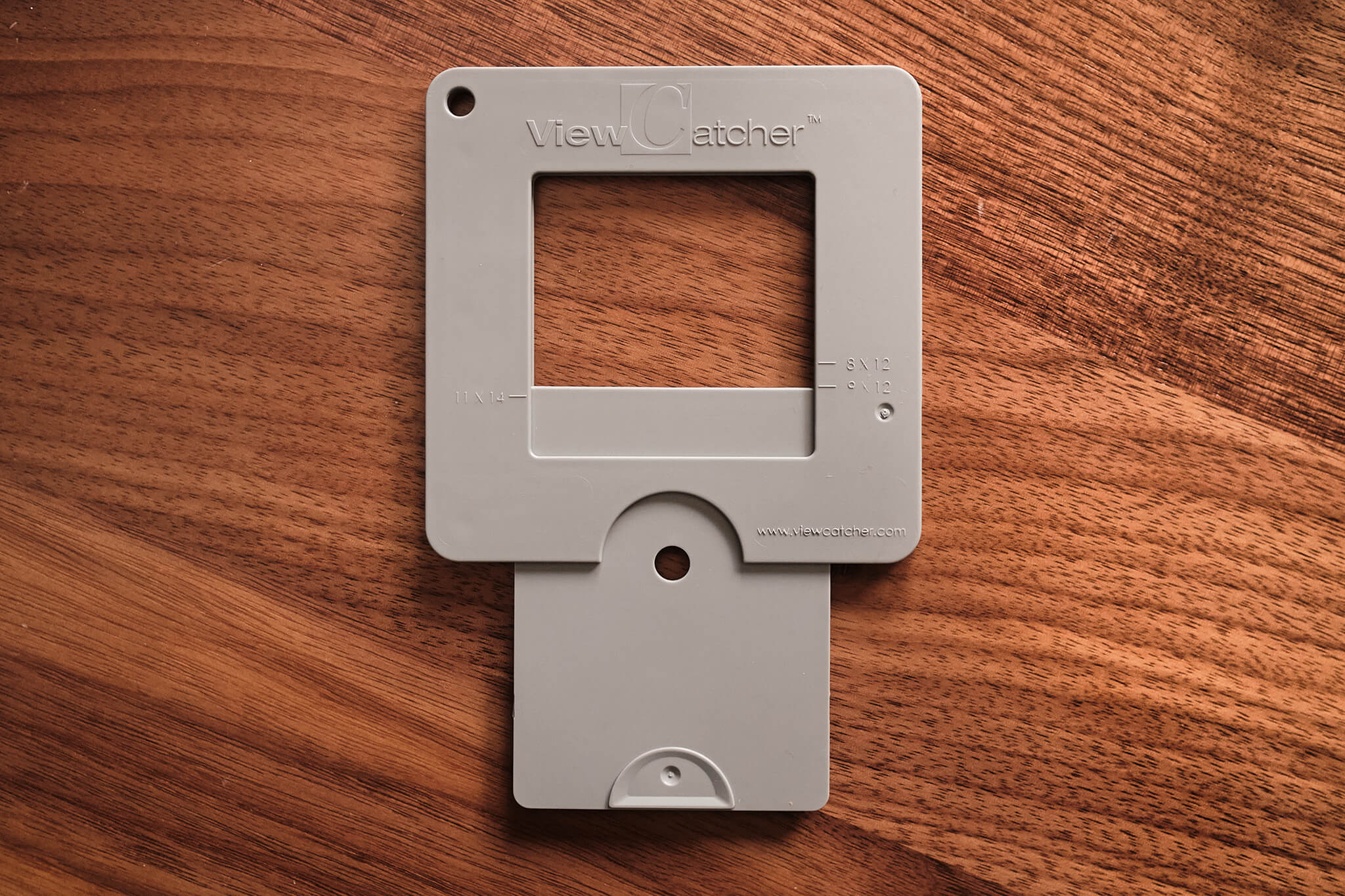
The ViewCatcher is a tiny little tool that is really useful for determining compositions when out in the field. It’s a plastic “card” that slides open to represent the view your camera would see. Here’s what it looks like:

The ViewCatcher

This thing may seem silly at first. But if you’re a photographer who walks around searching for compositions, I’m sure you’ve done one of the following two things:

  1. Stop to set up your tripod and mount your camera, only to find yourself continuing to move all over the area with your tripod fully extended searching for the best composition.
  2. You keep your camera out in your hand instead of your bag, repeatedly holding it to your eye to see if there’s a photograph to be made.

Both of those approaches are fine. But they drain battery, take time, expose your gear more, and can be annoying to deal with. With this little card, you can pull it out of your pocket as needed and focus your eye on a potential scene.

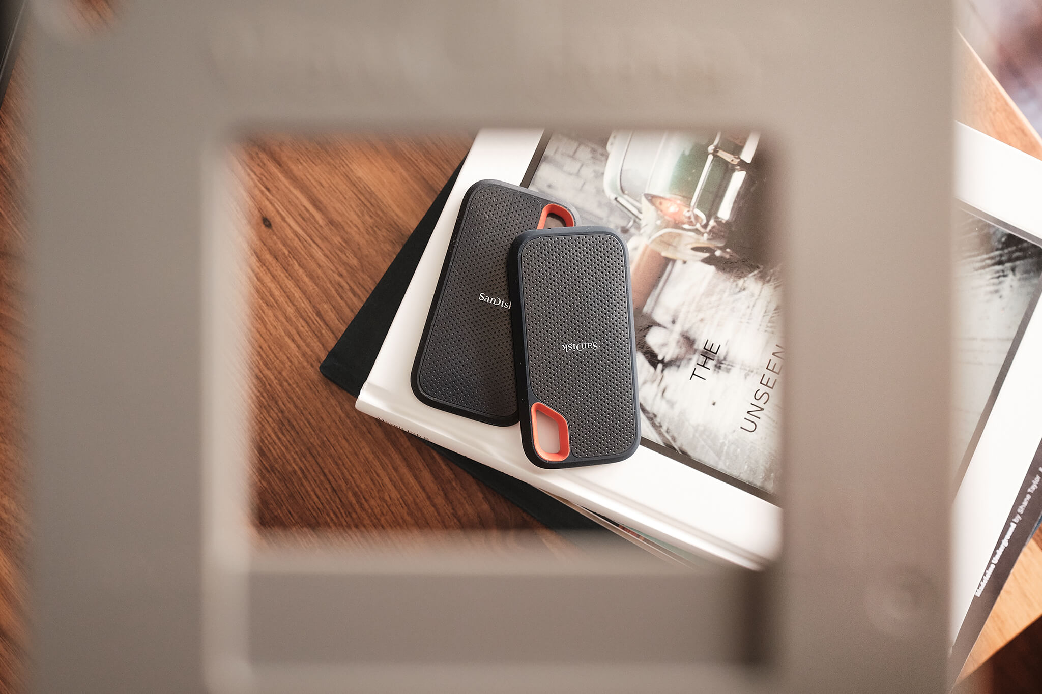
The ViewCatcher Example

If you’ve seen an old film director make a square with his hands and close one eye to look through it, this is that very concept. By filtering out the noise you can make better compositional decisions.

There are multiple popular aspect ratios supported (it has little marks indicating how far to slide it open):

  • 8x10
  • 8x12
  • 9x12
  • 11x14
  • 12x16

It’s quite handy!

Glass: An Incredible Photo App

Glass is a stunning application built for photographers. As soon as I found it, I knew it was what I’d been looking for. There are only a couple of brand new, subscription-based services that I’ve immediately signed up with, but Glass was one of them. Zero hesitation, zero regrets.

And as someone who’s into product development (if you care about that sort of thing), I can confirm for you that it has a brilliant design with an even better UX. It’s a pleasure to use and is currently my favorite app. Oh, and it’s pretty great in a browser, too.

Aside from it being a fantastic application on its own merit, the people behind it seem just as fantastic. I really love their creativity, ideas, blog posts, approach to feedback, and even their Twitter account — I’m happy to support them.

Since Instagram is no longer a good place for photographers these days (as it’s all about video, stories, and “the algorithm”), it’s a wonderful time to try something new. There are lots of alternatives out there, but for me, the clear winner is Glass, hands down.

Highly recommended.

File Organization for Photographers

When you do a thing that produces a ton of files, requiring some level of organization and backup, you need a plan. For me, it’s photography. I’ve been through many variations of file storage, but I think I’ve cracked it. When I got serious about photography, trying to find out what fellow photographers did wasn’t as easy as you might think, so I’m writing this post for the Google index, in case you’re also wondering.

Conventions

Before getting into the details, here are the conventions that I use. To start, I keep everyting in a Photography folder and utilize two top-level folders inside of that:

  • Captures — This is where all photos land off the SD card (deselects) before culling.
  • Photos — This is where all keeper photos (selects) are moved to for eventual post-processing.

I’m also assuming that you shoot in RAW and plan to post-process your photos in some fashion. The base file structure for both Captures and Photos looks like this:

 1Captures
 2  [YEAR]
 3    [MONTH].[DAY]
 4      [CAMERA]
 5
 6Photos
 7  [YEAR]
 8    [MONTH].[DAY]
 9      [CAMERA]
  • The [YEAR] is in four-digit format, and the [MONTH].[DAY] should always be in two-digit format (so 01.08 for January 8th, instead of 1.8).
  • The [CAMERA] is optional, but if you shoot with multiple cameras, or suspect you might at some point, I recommend getting in this habit. Putting the [CAMERA] folder inside of the [MONTH].[DAY] folder ensures that you can continue to browse photos by date (independent of the camera that made them).

Here’s an real example taken from my MacBook:

Photo Organization

Personal or Professional?

There are differing levels of “serious” here. If it’s a hobby, you need organization and some type of passive backup (optional). If it’s a career, and you have clients, you need organization and some type of aggressive backup (required).

I’ll break down some ideas for both.

Personal Workflow

STEP 1: Create the necessary [MONTH].[DAY] folders in the Captures and Photos directories.

STEP 2: Under each of the [MONTH].[DAY] folders, create a sub-folder for the camera that made the photos.

STEP 3: Insert your SD card and copy all of the files to the Captures folder, ensuring that they’re organized by date and camera per the first two steps above.

STEP 4: Culling! This means going through all of your captured photos and choosing the selects that you want to post-process. For this, I use Photo Mechanic. It’s the fastest media browser for large RAW files I’ve ever used. I’m sure there are others, but that’s a good one.

From here, I go through the photos and flag the ones I want to keep with a 1 Star rating. I mapped a keyboard shortcut to the number 1 key, which helps speed things up. Also, the z key zooms in/out which helps you verify focus.

STEP 5: Once you’re finished culling, you need to move the selects to the Photos directory, following the same date and camera sub-folder organization applied to the Captures folder.

I do this inside of Photo Mechanic. Once I have all of my selects flagged with a 1 Star rating, I filter the list to hide 0 star photos which leaves me with all of the photos I want to post-process. From here, I select all and drag them to their proper home in the Photos directory.

STEP 6: Importing! I use Capture One Pro as my post-processing app of choice. I spent years in Lightroom Classic, and while it’s a great app, it doesn’t process X-Trans (Fujifilm) RAW files as good as Capture One.

This part may vary, depending on which application you use, but the idea here is to import all of the selects from the Photos folder. Remember, you never import from the Captures folder. Oh, and for Capture One users: I prefer the “Add to Catalog” option so that it keeps the file system and my organization intact.

STEP 7: Exporting! I no longer export my edits unless I’m doing something with them (printing, making a book, sharing on social media, etc).

That said, if you like or need to export, I recommend creating an Exports folder inside of your [MONTH].[DAY] folder. For exports, I don’t think the extra [CAMERA] organization is necessary. You could even take things a step further importing the exports into Apple Photos so you’d have backed up copies in iCloud.

Speaking of backups…

Yes! Backups.

As mentioned above, photography is just a hobby for me so I have a relaxed solution to backups. Given that, I’ll highlight two things:

  • I do all of this file organization on my MacBook’s native SSD drive. When the drive starts filling up, I will offload several entire [YEAR] folders onto external SSD drives, freeing up my MacBook’s drive storage.
  • I’ve been a customer of Backblaze for many years, and I rely on it. I use a CalDigit hub that connects all of my external SSDs through a single thunderbolt cable, and I include those as part of my backups in the Backblaze config.

This isn’t a fool-proof system by any means, but it satisfies my personal tolerance for risk of data loss.

Professional Workflow

I’m not a professional photographer, but I can anticipate how I might do things a little differently if I were. For that advice, I’ll inject what-would-be additional steps into the “Personal Workflow”.

PREREQUISITES: A couple of things I’d recommend first and foremost:

  • I would shoot with a camera that had dual card slots, and I would dedicate one slot as file backup.
  • I would store files on external SSD drives instead of your computer’s drive. I would have equivalent drives: one to work off of and one purely as a backup.

STEP 0: Connect both external SSD drives. “Drive A” will be the working drive, “Drive B” will be the backup.

STEP 1 (modified): Create the necessary [MONTH].[DAY] folders in the Captures and Photos directories, but add suffix descriptions to the folder to identify the type of shoot and the client.

Instead of 01.24 you might have 01.24_Wedding-Smith or 01.24_Fashion-Jones, for example.

STEP 3a: Once everything is copied off of the SD card and into the Captures folder on Drive A, do an additional copy of that entire folder onto Drive B. Now you instantly have 2 copies of the files.

BONUS: If you use Capture One for post-processing, I would consider using its session-based catalogs instead of keeping all photos in a single catalog. This has many advantages for client-based photography, but I’ll leave that research up to you.

Conclusion

It’s been over five years since I’ve used some other means of file organization — this approach has served me well. I’m certain there are ways I could improve, but for me and my needs, it strikes a good balance of cost, risk, and convenience.

Hopefully this was helpful, and good luck :-)

Why Fujifilm?

My first digital camera was a Fujifilm A210 which had a whopping 3.2 MP. It was a little brick and I loved it. Eventually, I wanted to get “serious” about photography and have the ability to swap lenses. After some reasearch (plus budget limitations) I opted for a Nikon D80, and off I went.

Over the years the novelty of a shiny new DSLR wore off. It was clunky, an impossible daily carry, and caused me to stop making photos altogether. I only used it during events and missed out on everything else.

It was a sad time.

I’d been loosely following Fujifilm’s X-line for a bit, and with that old A210 in the back of my mind, I decided to take a real look at their current offerings.

In 2012-13 I pre-ordered the X100S. That camera single-handedly revived my love, desire, and attitude toward photography. Fujifilm had struck again. The size, fixed ~35mm lens, design/build quality, and image output made photography fun again. For the next five years, that’s the only camera I’d used to make photos.

Fast forward to today… My current set of bodies include:

  • X-T5: landscape
  • X-Pro3: family, portraits, and street
  • X100V: every day life, always with me

I’m all-in on Fujifilm and its X-system, let’s go over some reasons why.

APS-C vs Full-Frame

I’m going to get this out of the way… it’s always part of the argument. It’s a subjective choice to prioritize a full-frame sensor above other things, and I completely understand why one would. But speaking from experience, the X-Trans sensors are wildly good. They have great dynamic range, high-ISO performance, and plenty of resolution for most needs. Plus, the 1.5x crop factor has advantages, too (way more telephoto reach).

Full-frame sensors do out-perform APS-C in many ways, but you almost need 1:1 comparisons through pixel-peeping software to notice. I’m here to tell you that the delta is extremely small. I’ve been producing very sharp, high quality photos with Fujifilm cameras for years now.

Obviously, you don’t have to choose Fujifilm X, just be hesitant to blame APS-C as the reason.

Design

I struggle with a thing that functions great but has horrible form. I need both. Take Canon, for example; their cameras are SO ugly to me! I could never own one, even though I’m fully aware of how amazing the image output can be.

But Fujifilm? Wow. They definitely speak my language. To hold one of their cameras is both inspiring and motivating, specially the X100V and X-Pro3. These cameras will stay with me forever, purely on aesthetics. The only camera system I’ve seen who can top Fujifilm in both design, chosen materials, and build quality, is Leica.

Design matters, and Fujifilm continually nails it.

Film Simulations

I love the idea of film, with its limitations and uniqueness, but there’s no way I could deal with the post-processing of it all. Fujifilm, of course, has a long-standing history with film, and they’ve capitalized on that in the digital world through their film simulations.

In addition to their out-of-the-box simultations, you can easily create your own or adopt those created by others. Fuji X Weekly has some amazing recipes ready to go. If you’re interested in film, but don’t want the hassle of scanning and developing, shooting Fujifilm in JPEG mode with film simulations gives the film experience, digitally. It’s pretty fun, I must say. And their JPEGs out of camera are second-to-none.

One Sensor, Multiple Bodies

The way Fujifilm delivers its cameras to users is unlike other brands, and I love it. They really focus and prioritize the experience above all else.

When a new sensor comes out, that new sensor goes into all of the camera/body variations in the pipeline, so you’re never sacrificing on image quality. You just have to choose the ergonomics and design that speaks to you.

My X-T4, X-Pro3, and X100V all have the exact same X-Trans sensor, for example. Now, maybe the processor has more power on one camera versus the other (for example, not every camera can be built for sports). But in terms of quality, there’s no sacrifice. No matter the body, your images will be consistently incredible.

Firmware Updates

This may sound silly, but it’s actually a big deal. Fujifilm listens to its customers, and on top of that, regularly updates its firmware to bring new features to its cameras. Sometimes it’s for bugs or new hardware compatability, but quite often it’s for brand new features.

I haven’t seen many other brands take firmware that seriously, but Fujifilm releases useful firmware on a regular basis.

Lens Quality

Lastly, it’s probably worth mentioning the lens lineup. Without getting into the details, I’ve owned/used 20+ Fujinon lenses over the years and have yet to come across a bad one. They’re incredibly sharp and have a lot of character. There’s a lens for every use case, with more and more released on a yearly cadence (see the roadmap).

On top of that, many of the 3rd party lenses that are made for the X-system are stunning. My latest one is the Viltrox 13mm f1.4 and it’s one of the sharpest wide angle lenses I’ve ever used. The price? $429! I’m not suggesting to only buy 3rd party lenses, just that the X-system provides you with options you won’t find on other systems.

Conclusion

There’s magic in Fujifilm and I’m completely invested in the X-system. I really do love everything about it.

At the end of the day, though, cameras are just tools for creative output. The important thing is that you find a tool that you love to capture the moments you believe to be worthwhile. For me, that happens to be Fujifilm.

If you’ve made it this far and have specific questions, feel free to email me (ryan at rpheath dot com) and we can chat some more! Happy shooting!

Designing for the Big Picture

A very challenging aspect of designing something is keeping the holistic view in the forefront. It’s difficult because all of the individual parts of a design nag and pull for attention. We’re taught to care about the details, after all (and we should!). But that’s wherein the challenge lies: caring about the details with the big picture in mind.

Ryan Singer has talked about this a lot in the past. Specifically, in relation to designing with forces. The idea is to not let the design interfere with what the design is trying to accomplish, the problems at hand. Once you define the forces involved, that becomes your checklist for how well those individual parts are solving the problems. That separation is important.

As often the case with good solutions, it seems like a very obvious and simple approach, but we don’t always go about it this way.

I don’t think this is something that is easily conquered, it’ll be a challenge with design for as long as things are being designed. This is just one way—a pretty effective way—to mitigate the issues that can arise when the big picture hides in the background.

Humanizing Software

User-friendly software is a goal for anyone who builds or designs it. It’s a very tough challenge. Code, best practices, and browser-restrictions all get in the way, clouding up the human-factor.

For example, let’s look at user-restrictions. It’s easy, in code, to make a decision firm. Let’s say Plan A offers 5 users and Plan B offers 10 users. The logic to add a new user might go through a path like this:

1if (plan == A && users.count == 5) {
2  # too bad, you're maxed out!
3}

That’s what the software says. Clear as day, hard and firm. There are no considerations beyond that. But what if someone needs only 6 users? Just ONE more? Is the best solution forcing them to upgrade to Plan B? Maybe it is, but I’m not so sure.

What if that same conditional could be more like:

1if (plan == A && users.count == "close enough") {
2  # go for it, we want to make you happy!
3}

Is it better to have a happy customer with 6 users on a 5 user plan than a frustrated customer with 5 users on a 5 user plan? Forcing that customer to make a decision bumps up the chances they will leave. And if they don’t leave, odds are they’re hovering around the 5 user limit “making it work” to avoid the upgrade. So now they’re inconvenienced by the product, and that might leave a bad taste.

I’m aware that a line has to be drawn somewhere. Allowing 20 users on Plan A is surely too much, but paying extra attention to the edges is an interesting thought. If this were done manually, human-to-human, a real person might say “it’s no big deal, you can have one more user” in an effort to keep the person happy. Why shouldn’t software do the same thing?

Generally, rules are rules, and so it’s expected (even by customers) that they live within their plan restrictions. But wow, what an opportunity to go the extra mile and make a customer that much happier!

User-restrictions are just one of many areas where we can consider being less robotic. So, yeah, humanizing software. That’s what I’ve been thinking about lately. We’ll see where it takes me.

Early On, Let Ideas Be Cheap

A couple in their very first relationship often don’t get married; your first job out of school is likely not where you will retire; when car shopping, buying the very first car you look at probably isn’t the best approach. There are a lot of “firsts” in life that you shouldn’t get overly attached to, and ideas are no different. Let them be very simple, cheap thoughts early on.

This may seem counter-intuitive because, in design, we’re taught to really focus and hone in on a solution. Pay attention to every detail. It’s hard to hear things like that while also working fast and somewhat carefree. It doesn’t feel like they match up.

But, effort is directly related to how attached to an idea you become, and time is directly related to effort. The more effort and time you put into an idea, the harder it will be to let it go if it doesn’t work. Visualizing alternatives can unintentionally be skewed by the idea you went all-in on. So avoid all-in up front. Often enough, a simple sketch can give you the insight into whether or not it’s worth pursuing. You can scratch stuff out, make notes, and literally try anything you want.

So, a reminder: don’t run the risk of designing yourself into a box by over-dedicating to an early-stage idea. Keep the jobs-to-be-done in mind, but at first, try keeping the effort low. It free’s the mind to explore. Once you feel like the direction you want to go in has been realized, dig in a little deeper and put in the time and effort to see it through.

Shift: Is This Thing On?

I’m kind of surprised by the complaints I’m seeing on the new iOS 7.1 keyboard, specifically related to the Shift key. Folks are claiming that they have no idea if it’s on or off.

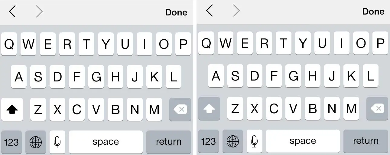
Just so we’re on the same page, here’s what I’m referring to:

iOS 7 Keyboard

The left shows the Shift key as on; the right shows it as off.

When the key is off, it blends with the dimness found on the other (non-alpha) keys. But when Shift is on, it’s bold and matches the display of the letters themselves. After all, if you touch “A” you expect it to do it’s job: give you an A. And if there’s a function of Shift, it’s to capitalize your letters (i.e. be on, not off). So thinking of an A as (always) on, doesn’t it make sense that the Shift key match the alpha keys when it is also on?

Maybe I’m scarred by thinking too deeply about these things on a day-to-day basis. To me, the existing function makes perfect sense and couldn’t be clearer. Is that because I’m often trying to solve similar UI-type problems? Or because it really is very obvious? Not sure.

Perhaps this is just another reminder of how Apple attracts very critical users, for better or for worse.

Personally, I love the iOS 7.1 keyboard. Kudos to Apple on a job well done.

Function Over Form

One of the most difficult aspects of design is staying focused on the function.

Dark Sky recently released a new version of their app. I’m not going to dissect its entire UI, because on the whole, it’s an incredibly well-designed app (and remains one of my favorites). But in an attempt to highlight where form may have inadvertently beaten out function, I’ll reference the first screen you see when the app opens:

Dark Sky

Overall, it’s lovely. But notice where the current temperature is placed… a black, bordered circle with rainbow text. Additionally, it neglects to incorporate the one symbol that identifies, immediately, that this is a temperature reading: the degree° symbol.

But why? Why the circle? Why rainbow text? Why no ° symbol? My guess is because form, in this case, won over function, which should rarely be the goal. It certainly does look good, but if it doesn’t make sense functionally, it can’t win. It almost feels more like a logo or an avatar, not a key piece of information that this app is trying to convey (to be honest, my first thought was Michael Jordan, not the fact that it’s 23° outside).

And yes, once you know what’s going on, it’s easy to dismiss it in the “your brain is now trained” sense. That might pass if I only had a few apps on my iPhone, and I used this one every single day. But that’s not the case. Instead, I have screens full of apps, which means tons and tons of different UI’s to interpret, and I actually don’t open this app daily. So maybe therein lies the rub.

At the end of the day, this is something I still struggle with, and probably always will. Even the great designers at Dark Sky aren’t perfect. Given that, when I see these things in other designs, it serves as a reminder that function must beat form in order to achieve the best result. Today, Dark Sky was that reminder.

Modern Day Craftsmanship

I design and build software for a living. There’s a lot of care and attention to detail that goes into software and design. And that’s what I do. It’s my craft.

Generally speaking, working in this industry has sharpened my eye. I seem to notice (and care) more and more about the detail that was put into everyday things. But I have to question if today’s “craftsman” can compete with those of the early days?

For example, I’m still in awe of the old, classic muscle cars. They’re timeless in a lot of ways. What cars of today will my grandkids look back on and wish they had? Even the latest Mustangs and Camaros are paying homage to the classic designs.

And what about music? Some of my favorite songs come from artists before my time. Subjective, I know, but I can’t help but wonder what music from today will still be selling in 40 years? I certainly don’t think Bieber Fever will last that long.

Maybe one of the most disappointing observations of all comes from modern day homebuilding. It’s just not the same. On the grand scale homebuilding has lost something. There’s no character or charm, rooms are just boxy and boring. That single-family, two-story bungalow with the wide porch pillars, tall baseboard, and detailed moldings is hard to find these days. If that’s your style, you might have to buy one built in the 1950s and renovate it.

Being only 31 years old, I realize it’s not entirely fair for me to speak to how they used to do it; but when compared to the craftsman of old, there’s clearly something missing from today’s output.

I believe the solution starts with the individual. We need to bring the craftsman back to craftsmanship. Care about what you do. You won’t be disappointed and the outcome(s) will undoubtedly lead you to a more fulfilled life.

The Shape of Design

A subset of the Foreward in a book I’m currently reading:

In that way, this book is not unlike a more ubiquitous tool and platform, the U.S. Interstate Highway System. Today, we take it for granted, mostly, but its numbering system at one point had to be designed. At a time when telephone poles lined dirt trails, Bureau of Public Roads employee Edwin W. James and committee were asked to come up with a more expandable system as roads were growing in the 1920s. They designed what we know today as the Interstate Numbering System. Prior to that, people relied on color codes for direction. Telephone poles were ringed with color bands lined highways, corresponding to individual dirt trails across the country. As trails expanded, telephone poles became painted from the ground up, sometimes fifteen feet high, so trying to distinguish among colors became dangerous.

E. W. James changed that. He decided that motorists would be able to figure out where they were at any time given the intersection of any two highways. North/south highways would be numbered with odd numbers; east/west with even numbers; and numbers would increase as you go east and north. The Interstate Numbering System was designed for expansion, anticipating the future contributions of people, cities, unexpectedness. It’s a tool. It’s a platform. And it’s still not done nearly 100 years later.

Love that perspective. The Foreward is by Liz Danzico. The book is The Shape of Design.

Fight Through the Crap

It’s typical for all designers and creative people to hit a long-lasting wall where nothing they create seems good enough. It’s a defining period of time for a lot of careers, and if you’re going to make it in the design industry, it’s important that you fight through the crap.

Ira Glass puts this in perspective better than anyone else I’ve seen, so I’ll defer to him:

Nobody tells this to people who are beginners, I wish someone told me. All of us who do creative work, we get into it because we have good taste. But there is this gap. For the first couple years you make stuff, it’s just not that good. It’s trying to be good, it has potential, but it’s not. But your taste, the thing that got you into the game, is still killer. And your taste is why your work disappoints you. A lot of people never get past this phase, they quit. Most people I know who do interesting, creative work went through years of this. We know our work doesn’t have this special thing that we want it to have. We all go through this. And if you are just starting out or you are still in this phase, you gotta know its normal and the most important thing you can do is do a lot of work. Put yourself on a deadline so that every week you will finish one story. It is only by going through a volume of work that you will close that gap, and your work will be as good as your ambitions. And I took longer to figure out how to do this than anyone I’ve ever met. It’s gonna take awhile. It’s normal to take awhile. You’ve just gotta fight your way through.

The Instagram Square

All images posted to Instagram must be a squared crop before they can be uploaded. I personally think this was a brilliant move. Here’s why:

  • Squares are proportionally correct. There are no misalignments or elongated edges.
  • Forcing a user to choose a cropped square has somewhat of a Dribbble effect in that it demands the most interesting section of the picture.
  • Squares are predictable in terms of designing an interface. It’d be hard to argue that against the fact that better designs can be built around images that are all of the same aspect ratio. Guesswork for unknown shapes creep into design decisions early and can look clunky more often than not, and when you’re dealing with something that is largely for visual purpose (i.e. photo galleries), that matters.
  • Easier implementation has to be mentioned, since there’s no post-processing needed to crop images into squares.
  • There are no surprises: what goes in is what comes out. The image proportions remain exactly as they were prior to upload.

I don’t know if those things were considered beforehand or if it was a side-effect of some other reasoning, but I do know that I’m glad Instagram only supports squared images. It’s one of the reasons I keep coming back.

Design Is Never Done

Iterations are expensive if nothing comes out of them (and yes, sometimes that’s unavoidable). But reminding ourselves that design can (and will) always be updated helps promote a flow of constant improvements, even if they’re not perfect.

I find that asking “Is this an improvement over the last version?” instead of “Is this perfect?” yields a better release cycle and (hopefully) happier users. Let’s face it, perfection doesn’t exist, even though we all use the term (loosely). Our goal should be to release, learn, update, and release to make sure our interfaces are always trying to solve the right problems the best way possible at that moment in time.

Remember, design is never done.

The Real Thing

Earlier today I watched Mike Matas: A next-generation digital book. If you follow him at all, you’ll know he’s an expert in design and UI, proven through his work on Mac OS and the iPhone. So naturally, before I started the video I expected his vision for digital content to be a good one. I was not disappointed: it was a really good one.

However, as good as the interactions and ideas were in their approach, I still see the value in regular books. I would hate the day the world goes all digital. Maybe it’s because I’m a designer and hence a visual person, but I find enjoyment in owning a physical book. Most of the books I buy are design-related, and things like textures, quality of the paper, the cover art, the spine, and content imagery are often just as inspiring (see Hardboiled Web Design). Those features – real, physical features – should not be taken for granted.

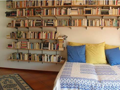
Plus, what would this shelving unit look like if physical books were obsolete?

Bookshelf

Something tells me they would lose their appeal if it were just an iPad sitting on its dock.

I’m all for digital books. I personally own a Kindle and I read content via iBooks on my iPad all the time. Digital books absolutely have their place in todays world, I just hope it’s not at the expense of the real thing.

Design Isn't Hard Because of CSS

I always seem to come across developers or young designers who believe the only thing preventing them from producing good design is learning CSS. Comments like “That’s simple, CSS is easy” or “I’d clean up the interface, but I don’t know CSS” completely ignore the core of what design is. Yes, CSS is incredibly easy. There are numerous tricks and, dare I say it, best practices that can be realized over time, but in general, CSS is a very easy language.

But CSS is only a means toward bringing a vision to life. It doesn’t do problem solving, it has no creativity, and it cannot satisfy client needs by itself. It’s a tool, just like any other language.

Design is hard because it demands mixing several concepts, ideas, and perspectives to produce a single, cohesive outcome. These aspects of design might include:

  • Clearly defining the problem–the most important step!
  • Determining the right solution, which often requires deep knowledge of the problem domain
  • The proper typography for the intended audience and/or goal
  • Understanding visual hierarchy
  • Meshing with existing branding (aesthetically)
  • Degrading gracefully
  • Determining the breaking points on mobile platforms (responsive design)
  • Figuring out what a client really wants

And then there are the technical aspects of executing a design, where CSS is one of the many components.

Design is far from easy, but it definitely isn’t hard because of CSS.

Progressive Enhancement Is Backwards

Progressive Enhancement is a well-known idea that web design should be a layered process, meaning a design should satisfy the least common denominator first and foremost (Internet Explorer), and then layer on enhancements for the browsers that support them. This was how I worked for a long time. But over the last couple of years I’ve been questioning it and actively doing the polar opposite. In fact, I now feel that Progressive Enhancement is backwards.

In no way am I saying that ignoring Internet Explorer is the proper approach. It’s not, as much as I’d love that. I’m saying that Internet Explorer doesn’t deserve “first dibs” on a design. It bakes in limitations and locks up the mind from the very beginning. And aside from that, Chrome, Safari, Firefox, Opera (and probably a few others I’m not aware of) are doing amazing work trying to push the web into the future via great performance and great support for HTML5 and CSS3. So why, when they are the browsers leading the way, should a design first go back in time to Internet Explorer, who is lacking in all of the areas in which the others are exceeding? It doesn’t seem fair, nor does it make much sense.

I’m of the opinion that a better design will come out of working in a cutting edge environment first and dealing with lesser environment(s) second, than working in lesser environments first and “enhancing” a restricted design second. Now, that may sound like graceful degradation, but it’s much more than that–it’s a shift in the way a designer thinks while designing, which I believe results in a much better outcome.

A freed mind can creatively take advantage of what’s possible, and only then can the full design potential come to life. I personally find it far more rewarding to be thrilled with the enhanced version than to be just happy with all versions.

Formed Function Gets A New Face

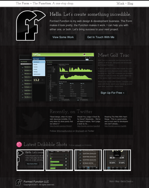
I’ve had a new design for formedfunction.com about a day from completion for quite a while now. Over the weekend I wrapped it up and shipped it out. Here’s a shot of the landing page:

formedfunction.com

It’s best viewed in a webkit-based browser (Safari and/or Chrome), but any modern browser will do just fine.

If you feel compelled to leave feedback, Twitter just may be the fastest way: @rpheath

Should you judge a book by its cover? Absolutely.

We’ve all heard it before, “don’t judge a book by its cover.” But why not? Because the creator didn’t care enough to make the cover representative of the content? I’ll need a better reason than that. In fact, that’s the exact reason why you should judge the cover.

Note: book, in this context, means a lot more than just books. It extends to anything that has a front-facing representation, ranging from a website to the packaging of your next coffee maker.

Good first impressions are where it’s at. When on a job interview a good first impression seems pretty important, right? And when you think about it, unlike products, there are a lot of ways to make that impression: clothing, attitude, previous work, eye contact, and what you have to say. Plus, there’s dedicated time set aside to focus on just you. With a product there’s only what shows on the outside. Potential buyers don’t interview products to see which one they want. So why then, would it ever be okay to neglect the first impression a product makes on a customer? Is it because websites and coffee makers can’t talk? Technically, that’s true. But products speak quite loudly–most folks just aren’t consciously aware that they’re hearing anything.

And yes… some products are very rude.

Rude products are those that don’t care about the message they’re sending. They believe that by being the product their job is done and the rest is secondary. They assume you’ll use them even though they didn’t take the time to impress you up front. They’re narcissistic.

Polite products, on the other hand, are those that really want to make you smile from the minute you’re introduced (Wufoo might be the best example of this), and they go above and beyond to make sure that’s the case. Thoughtfulness baked in from the beginning, setting the tone that you can expect good things.

While some rude products do sneak into the mix, the polite products will inevitably win out in the end.

It’s instinctual that we judge based on visual appeal, even if subconsciously, and when it comes to things that are designed there’s no better time to put our instincts to use. Start paying attention to the covers. Don’t forcefully ignore them because “the saying” said to. Often enough, those who care deeply about the outside care even more about the inside.

On Visual Hierarchy

Design isn’t about making something pretty, although that’s part of it. Design is largely about function. It’s about making an interface work so well that the user never stumbles. Much of a good UI depends on a notion called visual hierarchy.

Visual hierarchy, while it may sound technical, is really a pretty simple concept. By using color, contrast, texture, shape, position, orientation, and size, one can organize elements on a page so that users gets a sense of visual importance. For example, look at this graphic:

Where did your eyes go? Maybe to the first circle, since we naturally read from left to write. Or maybe somewhere in the middle. The point is, nothing guided your eyes because all of the circles are the same.

If you make everything bold, nothing is bold.

Let’s make a slight change to that graphic:

Now where did your eyes go? My guess is the first circle. With only shading, I was able to direct your eye to the circle that, for whatever reason, I believed to be the most important. This is visual hierarchy.

But we as designers don’t draw pictures of circles. Let’s talk about visual hierarchy in web design and show some real-world examples.

Note: when examining visual hierarchy, I prefer to use the squint technique (literally, I squint my eyes until the page becomes out of focus and blurred). Since I can’t blur your eyes for you, I’ll blur the screenshots instead. There’s no reason we need to see every pixel when organizing a page; in fact, the details get in the way at this stage.

A Poor Example

Ahh the Drudge Report. Much to my surprise, there are legitimate, successful designers who would argue that the Drudge Report is a well-designed site since it has “stood the test of time” (lame reasoning if you ask me). Needless to say, I’m not in that camp.

Using the Drudge Report as the guinea pig, let’s look at a poor example of visual hierarchy:

The screenshot above has 2 supporting graphics, 3 advertisements, 2 search/date filter forms, several sections, and a number of links that have different meanings. Breaking this down, the identifiable problems:

  • At a glance, you can’t tell the difference between the advertisements and the supporting article graphics.
  • There’s no easy way to detect where the search/date filter forms are located (hint: lower left corner).
  • All of the links (and sections) have the exact same treatment, but they don’t all have the exact same purpose (news articles, columnists, and content feeds).

Overall this site does a poor job of guiding the user through visual importance. Now let’s look at something I recently worked on.

A Better Example

The situation: in an app I’m working on there is a bit of setup required before the user can dive into the core of what the app does. Since setup instructions are generally a barrier-to-entry, the goal was to make it as easy as possible for the user to get in and out, knowing the exact steps they needed to take.

First, I’ll show where I started: the screen with very little attempt to organize the page. Then I’ll show how I used visual hierarchy and the difference that it made. Here’s the undressed version:

So what’s most important? I bet you don’t really know. Everything seems to be the same. You can see that there is a list, but it doesn’t really indicate that these are steps the user needs to take. It could be a grocery list for all we know (albeit, a wordy one).

Without introducing any color (yet), here’s the same page and content, only this time with an attempt to guide the user using different levels of visual importance:

Let’s go through the changes. The numbers on the graphic correspond to the numbers in the list below.

  1. Increased header size to be clear about the item being setup. It should be crystal clear as to what exactly is being setup.
  2. This line needs to speak to the user before anything else, because for experienced users, it could potentially remove the need for the setup instructions altogether. So I increased the font a bit and separated it from the content below using a border-bottom (look closely).
  3. Using nothing but space, I was able to disconnect the upper and lower content sections even more, essentially saying “Read This First”.
  4. This title sets up the purpose of the content below it, so I bumped up the font size and made it bold. Subtext next to it isn’t quite as important, so it’s dimmed a bit (but by drawing attention to the main text, the right text is inherently read, but without the additional noise).
  5. This is a menu of options where each option contains its own set of instructions–it’s incredibly important that the user knows which option they’re on, but above that it’s to illustrate that their are options. Also, this menu was to act as a header to ground the instruction set below it.
  6. Each “step” has a title and a instruction. By bumping up the section title I’ve essentially scoped what the content below it is explaining. It’s important that the user could scan the list just to get an idea of what was involved, then dive into the details. The instruction paragraph was also given more space above/below and increased line-height to help with readability.
  7. These numbers should feel more like “steps” than a list. By squaring them up, increasing the size, and giving some visual depth (contrast), I was able to achieve that. This no longer feels like a wordy grocery list.
  8. The support help/text is important, but it should not get equal attention as the instructions themselves. So by moving it down the page, decreasing the size/line-height, and softening the color, I am basically saying “this is here if you want it, but it’s not quite as important as the rest”. In the rare case that a user needs more help, he/she will be explicitly scanning the page for help information, so it’s less of a concern to make it stand out–it will undoubtedly be found if need be.

When positioning elements on a page I like to work in gray tones first, like the screenshot above. You can do a lot with just contrast and sometimes colors get in the way early on. However, once you achieve a solid foundation on position and weight, color can take the visual importance even further. Take a look at the same screenshot, but in color:

The end result is much better than where I started. It’s now (hopefully) clear to the user that they have a step-by-step process to go through, and (hopefully) each step is clearly defined and explained.

Conclusion

Visual hierarchy is just another tool in the tool-belt, but I believe it’s among the most important. If nothing else, hopefully this helps other designers by at least reminding them to start with the function and flow before the fancy graphics. Nail down the purpose of each page element, and then dress it up.

Happy designing!

On Design Criticism: Out With the Negative, In With the Constructive

Whenever something relatively large launches (like a Facebook update or New Twitter) there are always a slew of “haters” disrespectfully attacking the design from all angles. The problem is blatant disrespect is rarely constructive.

Take the whole Gap logo redesign ordeal. That was a prime example of how not to be. Other designers were mocking the logo with “Crap” (instead of Gap) and being incredibly demeaning toward those who worked on the redesign. It was an awful display of character by so many people.

Currently it seems that the hot, fresh out-of-the-box target is the Mac App Store. For example, take a quote from this response (titled, Mac App Store UI is so hideous that it makes me want to kick a swan):

As expected, it pretty much confirms my thoughts that someone decided to shoot most of Apple’s designers some time around when brushed metal appeared, along with giving everyone at Cupertino a taste-ectomy. The app UI is just hideous, kicking conventions in the bollocks, laughing in the face of clarity, and mercilessly setting fire to UX and pushing it off a cliff.

Seriously? That bad, huh? Even if so, I don’t think it deserves such a degrading response. Nothing does, really. What that quote could have been:

I’m not a fan of the Mac App Store UI. A few common conventions have been broken and the overall experience isn’t as good as it could be, especially coming from the UX experts at Apple. For example, …

That post does go on to make several valid points, but it’s the link-baiting negativity in the title and intro that bothers me. There’s simply no benefit in barefaced negativity toward someone else’s design.

The same thing happens in sports. There will always be fans who get pissed off at a coach for a bad play call, when more often than not, the person complaining couldn’t do a fraction of the job the coach is doing. In sports I expect it, but I really hate to see this behavior make its way into design communities. Every single designer to date has produced crappy work. It’s part of getting better.

It’s challenging to produce good design, there’s no doubt about it. There are many problems to solve within a single solution. But what’s not challenging is to come along at the end and pick out the 5-10% that may be off kilter and run it into the ground because “you could do better”. It’s a different view when starting with a blank slate, I can assure you.

Next time try to remember that there are caring people behind both good and bad design who, in most cases, put a lot of time, thought, and effort into what they do. Maybe they’re not professionals (yet), but they’re trying.

So let’s declare 2011 the year for constructive criticism and we can raise our glasses to better design as a result.

Freelancers: Are You Billing Clients Like a Lawyer? If So, Stop.

Amy Hoy and Thomas Fuchs just may be the most impressive design & development duo on the internet. Amy’s designs are often so friendly you can’t help but smile and sign up, and Thomas, being the JavaScript mastermind that he is, adds some incredible UI touch.

To give something back, they’ve put up what they call Freelancember, which more-or-less gives advice to freelancers. And the design is the typical excellence we’ve come to expect from them. You should take a look.

With that said, this one kind of surprised me: Top 10 Things You’re Forgetting to Bill For. I just read it, so it’s still sinking in, but it did spawn the urge to write down a few thoughts regarding the topic.

Petty charges feel impersonal. I like to work on cool projects, but first and foremost, I like to work with cool people. People I’d like to be friends with. Putting something like “Copies & Faxes” on an invoice, to me, sends the message: we can never be friends, this is strictly a business relationship and you have to think twice before you give me a call (or send an email)–I’ll bill you for it!

Petty charges are a nightmare to keep track of. It’s hard enough trying to keep track of the time you’re actually working, it’s difficult to fathom recording every moment I think about a project, write an email, talk on the phone, make a copy, etc. Sure, I might be losing out on more income, but I’m not out to squeeze a client for every cent–I’m out to make a respectable living doing great work. That’s what makes me happy.

Petty charges cost more than they’re worth. In general, I think these petty charges cost far more than they’re worth, and not just monetarily speaking. Future work, recommendations, rewarding relationships, and so on are also at stake. People look out for friends, and it’s hard to imagine charging a friend for the gas you used driving to a meeting, isn’t it? Well, that goes both ways.

People like simple. A client would much rather get an invoice simplified down to expected services at a known cost. Mixing in erroneous expenses will add unnecessary complexity. Complexity leads to confusion, confusion leads to asking questions, and asking questions leads to distrust. Sure, you could add a few minutes to your other items, but that feels just as sleazy.

Now, I do understand the point they’re trying to make. If you sit down at your desk from 6pm to 11pm but only seem to accomplish a few simple tasks, it’s hard to eat 4 hours of personal time. There will undoubtedly be discussion, sketching, trial-and-error, etc. and it’s up to you to evaluate the situation. Sketching and productive design work? Sure. Writing up a contract and emailing it to a potential client? Absolutely not. That’s all I’m saying.

Just like I try to treat every project as if it were my own, I strive to treat every client the same way I would like to be treated. I’ve met some incredible people along the way, and have sustained solid relationships with great results. I personally don’t believe I would have gotten here if I billed my clients like a lawyer. Money isn’t the only way to be rewarded, remember that.

So, fellow freelancers: Lawyers can get away with billing that way because society has allowed them to set the expectation, but only another lawyer would think it’s not dirty to charge 4 minutes for an email reply. We’re not lawyers, so we shouldn’t bill as if we were.

While NOT charging for petty things may go unnoticed, I can assure you charging for them won’t. Think about the message you’re sending and ask yourself if it’s worth it.

Pinboard's Pricing Model

With all of this talk of delicious going away, I too exported my bookmarks and decided to try out Pinboard. Before signing up I noticed there was a price, which I was not expecting. It was only a small one-time fee, worth the money alone just for safe-keeping of my years worth of bookmarks.
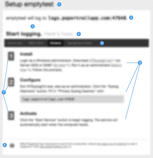
But what struck me the most was the fee itself: $6.47. It was kind of an odd number. After looking into it, I realized it’s actually quite smart.

Pinboard charges $0.001 times the number of customers it has, for each new user. And when you think about it, this works on a lot of different levels.

Spam protection. Immediate spam protection because spammers don’t pay. This keeps the system itself clean of spam-checking code, too. And not to mention serious users only. A win right off the bat.

Marketing. The longer you wait to sign up, the more it’s going to cost you. It gives you the “OMG I need to hurry” urge that brings out the impulsiveness in all of us.

Scaling. The more users they have, the more it costs to sign up per-user, hence, the more money they make to keep the service running.

One-time fee. I think most people would be more inclined to pay a larger one-time fee than a smaller recurring charge. It’s closure for customers and simplicity for Pinboard. Plus, even though it’s a one-time fee, the fee keeps going up, so in a way they’re still making money off of their other customers, but without charging them.
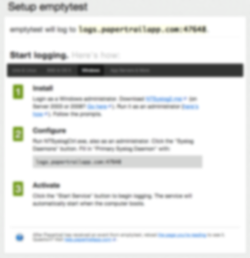
And I’m probably overlooking a few other things, but in general, I think that’s a pretty clever way to charge your users.

Clients: Browsers Are Different, Accept It

It’s mind-boggling how many times I’ve heard designers say something like “I can’t wait until CSS3 is supported across all browsers so I can start using it!” If that sounds like a reasonable claim to you, don’t worry, you’re not alone–even I used to think that way. But that perspective is a real problem.

If/When CSS3 is finally supported across all browsers, there will be browsers with CSS4 support. It’s a never-ending cycle. Some browsers will live on the bleeding edge of technology, and some will take years to catch up. That’s the way it will always be, so it doesn’t make sense to design by the least common denominator, hanging on to false hope, dreaming of the day when you’ll implement a design once. Your life as a designer is too short for that! You should be using the cool stuff as fast as it comes out (where applicable, of course).

Cross-browser support for CSS3 and similar technologies is often said to be the greatest day in a designer’s life. “Can you imagine the day when all browsers are the same?” Back to reality. I say the greatest day in a designers life is when clients begin to realize and understand that their design simply cannot look the same in every browser. That’s the breakthrough I’m waiting for, and that’s what will give designers more freedom to truly be creative.

Browses are different, we (designers and clients alike) need to accept that so we can move on and create awesomeness.